UPDATED MAY 25, 2026
Does your website have problems?
When I talk to business owners, they typically have two main complaints when it comes to their websites. The first is that the website isn’t getting enough traffic. The second is that the website isn’t converting enough new business.
The real problem is a little more nuanced.
Because what you need is the right traffic, in the form of your ideal customers. And the right business in the form of the people who need and are the best match for what you’re selling.
When you get those two things aligned, that’s when the magic starts to happen.
Common reasons for low website traffic
If your site isn’t getting enough traffic, it could be for one of the following reasons.
Your website is too young
If your new website isn’t getting any visitors, it may because it’s too new and hasn’t been online for long enough.

A brand new website with a brand new domain could take up to six months to start appearing on Google.
If you have Google Search Console on your site — and you should have — you can start by checking to see if your site has been indexed. If it hasn’t, you can submit it to Google.
How to check if your website has been indexed
- Open your browser and log into Google Search Console
- In a second tab, open your website and copy the URL of your home page, e.g. https://www.yourwebsite.com
- Return to Google Search Console. At the very top of the page, you’ll see a search box that says ‘Inspect any URL in ‘yourwebsite.com’. Paste your home page URL into this box and hit the return key.
- Google will then tell you if the URL is on Google. If your URL is on Google, you don’t need to do anything else here. If it isn’t, you’ll be given the option to submit your URL to Google.
Submitting your site to Google is one way to get your site indexed quicker. Another way is by regularly adding SEO content in the form of a blog.
There’s no SEO copy on your site
If your website has been indexed by Google, but still isn’t getting visitors, that could be because it doesn’t have Search-Engine-Optimised (SEO) copy on it.
Think of the internet as a giant database. When you type a search term into Google, it comes back with a list of the websites that match your search term most closely.
The reason these particular websites come up is because they contain the search terms you’ve typed in.
You want your own website to be included on this list when your ideal customers type a search term. And for that you need your website to be written with SEO copy.
How to get Search-Engine-Optimised copy
You could learn to write SEO copy yourself, but that could take a while and, let’s face it, you probably have other things you’d rather be doing.
Alternatively, you could hire an SEO copywriter to write your website. SEO copywriters have the experience, the skills and the tools to write the effective optimised copy your website needs.
Your website takes too long to load
Impatient users and slow websites aren’t a good combination.

If your website is taking too long to load, visitors could give up waiting before they’ve even paid you a visit.
And how long is too long?
In 2026, that would be anything longer than 1-2 seconds.
How to speed up a slow website
To check your website’s loading speed, visit GTmetrix and enter your URL in the Test Your Site box.
The tool with then report back with your speeds and, if necessary, advice on how to improve them.
Slow speeds are often caused by large, unoptimised media files, like large, hi-res photographs and hi-def video. These issues can be fixed using an image or video compressor.
You’re not promoting your website
Not all your potential website visitors will find you by searching on Google. Some will come to your site from links on your social media posts and online profiles. From backlinks on other websites and from online advertising.
But only if you’re promoting your website in those places.

Promoting your website is an important part of your online campaign. If you’re not doing any outside promotion, you’ll be missing out on what could be a large proportion of your traffic.
How to promote your website online
There are a number of ways to promote your website online. Here are a few examples of things you could be doing:
- Social media posts
- Social media advertising
- Online advertising, like Google Ads or Meta Pixel
- Backlinks from other websites
- Links to your main website from your blog.
For more information on backlinks, check out my article: A beginner’s guide to backlinks and link-building >>
Common reasons for low conversions
Your engagement rate is low
A low engagement rate means the visitors who come to your site aren’t sticking around long enough to buy or enquire.
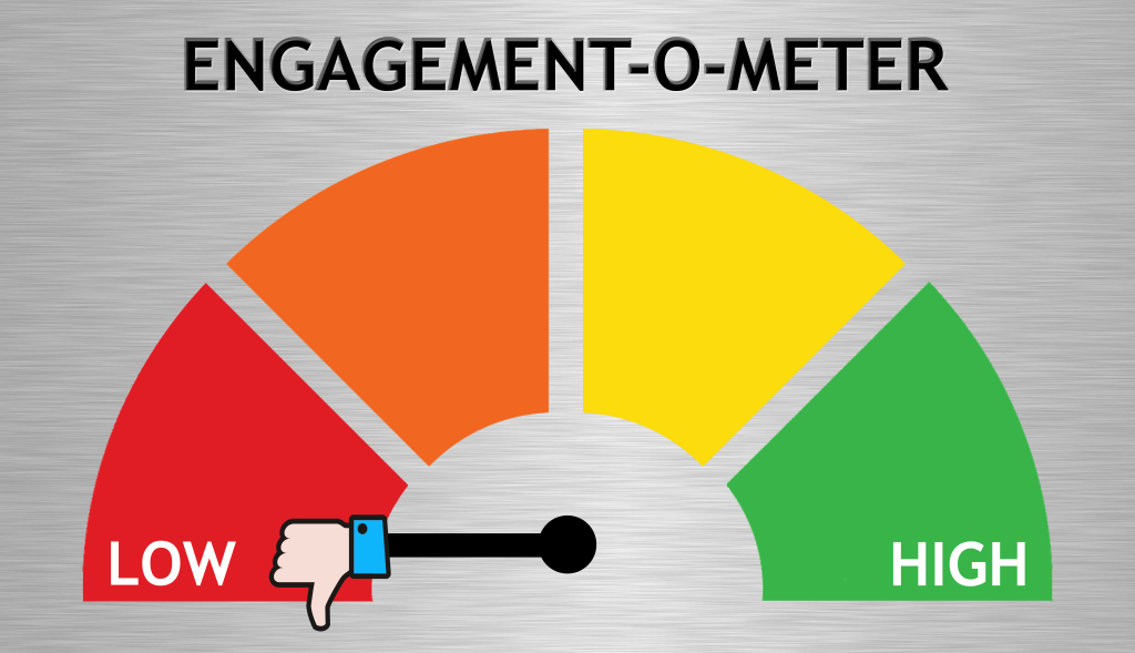
Your website’s engagement rate is the percentage of engaged sessions your website is getting.
An engaged session is a website visit that:
- Lasts 10 seconds or longer;
- Has two more page views; OR
- Has one or more conversion events.
According to databox, the median engagement rate is around 56.21%. Experts say a good engagement rate is anywhere between 60% to 90%, but it depends on the website and audience.
Reasons for a low engagement rate
There are a number of reasons why your engagement rate might be low, such as:
- Not meeting visitors’ expectations
- Attracting low-quality traffic
- Design that doesn’t adapt for different devices
- Badly written content
- An unclear value proposition
- Ineffective calls to action (CTAs).
You can find more detailed information on this in my article:
What causes a low engagement rate in GA4? >>
How to increase a low engagement rate
If your website’s engagement rate is inexplicably low, there are a number of things you can check, and possibly fix, yourself:
Check your website’s load speed
Your website should load in 1-2 seconds.
If your website is taking longer than that, potential visitors will already be hitting the back button. And this will be lowering your engagement rate even though they haven’t actually visited your site.
To check your website’s loading speed, visit GTmetrix and enter your URL in the Test Your Site box.
The tool with then report back with your speeds and advice on how to improve them.
Check for broken links
Visitors can’t progress through your site if the link for the page they want to view is broken.
The easiest way to check for broken links on your page is with a free checker or using a broken links plugin. If the checker does find broken links, you should be able to track them down and fix them.
Ensure your website is delivering what it promises
Visitors will leave without engaging if they arrive on your website and find something they weren’t expecting to see. So make sure the website delivers what the links to it are promising.
Limit your use of pop-ups
Pop-ups have their uses, but they can also be incredibly annoying. If there are too many pop-ups on your website and/or they’re difficult to close down, some visitors will leave.
If you have several pop-ups on your site, consider reducing them to just one. Then see if your engagement rate improves.
Ensure your website is easy to navigate
Visitors won’t visit other pages of your site if they don’t know where to go.
Make sure your navigation is clear and easy to use.
Ensure your website is compatible
Your website should give a good experience to all users.
There are lots of website testers out there that will let you view your site on different browser platforms and devices, to make sure it’s viewing and working correctly.
Your website doesn’t make it clear what you do
The first job of a website is to explain clearly and simply what your company does. This reassures the reader and lets them know they’re in the right place.
You might think this should be obvious, but so many companies get it wrong.

If a visitor arrives on your website, they should be able to understand what you do in five seconds or less.
But you might confuse them if you:
- Don’t spell it out to them clearly
- Display misleading images and visuals
- Talk about benefits without explaining how the benefits will be achieved
- Use vague and non-specific words, like ‘solutions’
- Try to be clever or use too much industry jargon.
How to communicate what you do more effectively
As a general rule, your website should start by explaining what you do and who you do it for. You should be able to do this in a couple of sentences, using plain English that anyone can understand.
Make sure your website gives a cohesive first impression. Use clear language and relevant images that represent your brand and help your visitors to understand what you can do for them.
Your website isn’t connecting
Your website isn’t delivering what your visitors are expecting to see.

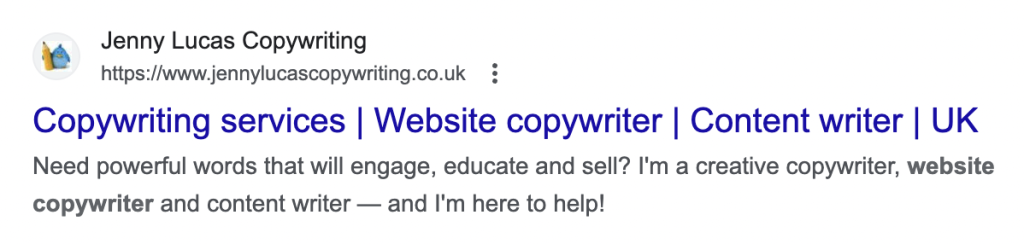
Visitors use the copy that accompanies your link to help them understand what your webpage is about before they decide to visit. On the Google results page, for example, they’ll look at the page title and meta description.
Below, you can my listing on Google, the blue heading is my page title and the two black lines underneath are the meta description.
But if what visitors see when they reach your website is different to what they were expecting, they might think they’re in the wrong place and leave.
How to avoid disappointing your visitors
To avoid disappointing your visitors, you need to make sure their experience is fluid and flows consistently — from the link they click to reach you to the landing page they arrive on.
- Make sure your page delivers what it promises
- If you update a page, check if the title tags and meta descriptions need updating, too
- Check your backlinks and the online directories you’re listed in to make sure your updates don’t affect them
- If you’re running an online offer or promotion, have visitors click through to a dedicated landing page rather than just a page of your website.
For more advice on landing pages, check out my article:
How to create the perfect landing page >>
Your website isn’t responsive
People browse the internet on a range of devices. And they’ve come to expect a good experience that’s tailored for the device they’re using — whether that’s a desktop, laptop, tablet or smartphone.
For that, you need a responsive design.
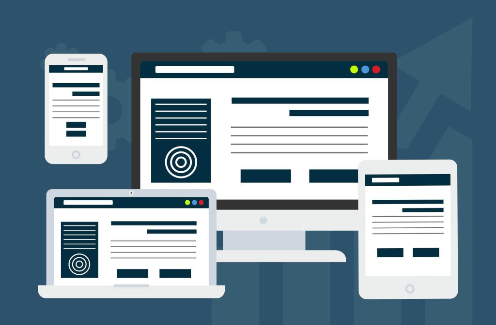
A responsive site will adapt to suit the size, shape and orientation of each screen. If yours doesn’t, you’re probably giving your visitors a bad user experience. And bad user experiences rarely result in sales or enquiries.
How to test if your website is responsive
If you’re not sure if your site is responsive, you can check it using this free tool.
The tool will show you how your site appears on a range of different tablets and smartphones. In each case, your site should resize itself to fit the device screen.
If it doesn’t, the only way around this is to get the site redesigned — either professionally, or using a responsive template from a leading website builder, like WordPress, Squarespace or Wix.
Your website is badly designed
A badly designed website can be off-putting to visitors and crush customer confidence.
There’s a reason we don’t design websites like this any more. There’s so much going on here, you don’t know what to look at first and your eye can’t settle on any one thing.
With time and experience, our web design skills have improved and we have a much better idea of what counts as good and bad design. Here’s a quick summary:
❌ Bad website design
- Dated and cluttered with too many different elements
- Strange colour combinations that are unpleasant to look at, or make the text hard to read
- Complex navigation that hides vital information out of reach
- Stock photographs that don’t represent your business
- Text that spans the whole screen with no borders or breaks
- Oddly sized text that isn’t spaced out properly.
✅ Good website design
- Fresh, modern appearance with lots of white/clear space
- Clean and streamlined layout
- Easy to navigate and find information
- Simple, non-distracting, single-column format for the text
- Relevant high-res images that are pleasing to look at.
How to improve the design of your website
If you feel your site is old and dated looking, it might be time for a refresh and a rebrand.
Depending on your available time and budget, you could do this yourself or hire a professional web designer.
To help you decide and give you some guidance, I’ve created a couple of helpful resources:
Learn about The pros and cons of DIY website design >>
Avoid these 15 Cringeworthy web design mistakes >>
You have some annoying website features
The last thing you want to do is annoy your potential customers, so take some time to think about the features on your website, how they present themselves and whether they’re really necessary.

Multiple pop-ups in quick succession
I once landed on a website where the following six pop-ups appeared in quick succession:
- You must accept our GDPR policy
- Here are the GDPR policy choices you made
- Thank you for accepting our GDPR policy
- Sign up for our newsletter
- Register for a free ebook
- A huge chatbot box asking how it could help.
I had to accept or close them all down before I could see anything on the website — only to find there was nothing worth looking at. How irritating!
Irritating pop-ups
- Pop-ups that appear on every page of the site
- Pop-ups you can’t close down without completing the sign-up
- Pop-ups with passive aggressive opt-outs, like ‘No thanks, I already know everything’.
Other annoying features
- Error 404 pages (Page not found)
- Intrusive advertising/chatbots
- Sign-up boxes with no option to close them
- Distracting carousels or animations
- Autoplay videos.
Worse than just being irritating, all these things are a distraction for your visitors — taking their attention away from where it really needs to be. And that’s if they decide to stay at all.
How to avoid annoying your website visitors
GDPR consent
Unfortunately, GDPR and privacy policy consent is a necessary irritation. It needs to be there, but it doesn’t have to be disruptive. A non-intrusive banner with an accept button should suffice. Your visitors don’t need you to follow up by confirming their choices or thanking them for making a choice.
Sign-up boxes
Give your visitors a chance to get to know you and see what you’re about before you bombard them with sign-ups. Set these pop-ups to appear as they leave the site, rather than when they arrive.
Broken links
A broken link will send your visitors to an Error 404 page, which will tell them the page they’re looking for can’t be found.
You can check your site for broken links using a broken link checker or plugin.
If you’ve removed pages, make sure all links to them have also been removed or updated.
Carousels, animations and videos
Carousels are the sliding panels you see at the top of some websites. If they’re large and move quickly, you can still see them at the top of the screen when you scroll down — and this can be distracting.
If you use carousels on your site, make sure they don’t change too frequently. Consider stopping the carousel after the first cycle. And add arrows, so visitors can scroll through them manually, at their own pace.
The same with animations. Avoid continuous looping — let them play once or twice, then stop. Or, if you can, stop them when visitors scroll past them, so they’re not creating a distraction at the top of the screen.
Autoplay videos can be annoying — especially if they stall your site while they’re loading or play unexpectedly with sound. Visitors should always have the option to watch your video or scroll past it.
Your website is difficult to navigate
If your visitors have a hard time trying to find their way around your website, they might give up before they’ve found what they were looking for.

Your website should make it easy for visitors to find their way around. And, ideally, they should be able to access any page within three clicks.
Navigation usually works in two ways: a main navigation bar across the top, which links to all the main pages of your site; and signposts, like text links and buttons, which appear at key points on each page.
Your signposts should anticipate what visitors want to see at each stage of the customer journey and include a link that takes them to the relevant page.
For example a customer journey might go from the homepage to the relevant service page, to your portfolio, to your testimonials — then, finally, to your contact page.
How to improve your website’s navigation
Start by looking at your main navigation bar and make sure it contains links to all the main pages of your website.
Then go through each page, looking at the key points, which are usually at the end of each section. At each point, ask yourself, what does my visitor need here? and add the relevant signpost.
You can test your navigation by bringing in an outsider and asking them to navigate to specific pages of the website. See how quickly and easily they can do it. If it’s not quick and easy, ask them where they’re finding it difficult and try to improve it.
Your copy is sloppy
On a website, the written content is everything. And if yours isn’t doing its job, it could be costing you customers.

Your copy is how you talk to and engage your target audience. It’s where you show them how you can solve their problems or introduce them to irresistible things they’ll want to buy.
Some websites fail miserably at doing these things and it’s usually because their content is:
- Dull and boring
- Littered with errors
- Difficult to understand
- Poorly explained
- Badly written and awkward to read
- Stuffed with SEO keywords
- Focused on the company — not the customer.
How to fix bad website copy
You can rewrite your website, or ask someone on your team to do it. But it makes much more sense to hire a professional website copywriter.
Because what you really need is someone who knows how to write for your audience. Someone who can engage them, inform them and persuade them to buy from you. And someone who can take care of the SEO side, too.
Hiring a professional will be more expensive, but it will be money well spent and the returns will be higher. Because whatever you pay a copywriter, you can expect to make back many times over.
If you want to try rewriting the copy yourself, you’ll find a shedload of free writing tips on my blog!
Your calls to action aren’t working

A call to action (CTA) is anything on your website that prompts your visitors to take action. The action could be anything from visiting another page to getting in touch with you.
For example, it could be:
- An internal link
- Your telephone number
- A contact form
- Your email address
- A sign-up box for your mailing list.
But on some websites, the CTAs simply don’t work. There are a number of reasons for this, including:
- Buttons that don’t do anything
- Broken or incorrect links
- Unclear links or button text
- Contact forms that don’t send
- Buried, missing or incorrect contact details.
How to fix your CTAs
Your CTAs should be clear, obvious and placed right where your customers can see them. If you can, use coloured buttons that contrast with your background and make any text links obvious.
Make sure your links and buttons give visitors a clear expectation of what will happen when they’re clicked — and make sure they follow through. If you’re expecting visitors to sign up for something, be explicit about what they’ll be getting in return.
Make it easy for people to get in touch with you. For example, display your phone number prominently at the top of your website rather than burying it in the footer where it’s harder for visitors to find.
Spare a thought for your mobile visitors, make sure links and buttons are well spaced to allow for a thumb press.
Check regularly that all your buttons, links and forms are working properly.
Your process is broken
If you have unexplained low take-up on your website, there may be a technical fault in your process.

Technical faults can cause forms not to send and blips in the customer journey, resulting in things like low mailing list sign-ups and abandoned shopping carts.
How to identify technical faults
Technical faults can sometimes arise following an update to your web platform or a browser.
If you have a web designer who also manages your domain, they may conduct routine tests for this sort of thing. But sometimes, the only way to find a technical fault is to routinely test out the processes yourself.
Some websites also have a button or link for customers to report any technical problems.
Your contact information is problematic
If you’re offering a service, the main goal of your website is probably getting visitors to contact you. If they’re not contacting you, it may be a problem with the way you’ve structured your contact information.

So what could be the problem?
Here are some examples:
- You’re not making it easy enough for visitors to contact you
- You don’t give visitors enough contact options
- Your contact form isn’t working
- The link to your contact page isn’t working
- Your contact details have changed and your website hasn’t been updated
- Your contact form is too long and detailed, which is putting people off.
How to improve your ‘contact us’ section
Make it easy for visitors to contact you using your preferred contact method. For example, if you want them to call you, have your phone number displayed prominently at the top of your website.
Give visitors a range of contact options. These might include:
- A phone number if they need an immediate response
- A mobile number with the option to text or WhatsApp you
- A contact form if they’d prefer to send their needs in writing
- An email address if they want to send you some additional files
- Social media links if they want to connect with you and get to know you better first.
Check your contact form regularly. Sometimes they just stop working and you may never know.
Make sure you have an accessible contact page and that the contact details on it are all up to date.
Make your contact form as short and easy to complete as possible. Remember, a contact form is only for making contact and the customer hasn’t decided if they’re going to work with you yet. The minimum would be to ask for their name, their message and either a phone number or email address so you can follow up with them.
Do you need help with your website?
If your website isn’t working out the way you think it should, and none of this advice has helped, there may be a deeper problem. And you may be too close to it to work out what it is.
As a copywriter who’s been working on websites for the last 17+ years, I’ve learned a few things about what makes a website successful. And I can give you an objective analysis of your website and where it might be letting you down.
To find out more about how I can help you, please get in touch and let me know more about the problems you’ve been having.

You might also like…