UPDATED JUNE 18, 2026
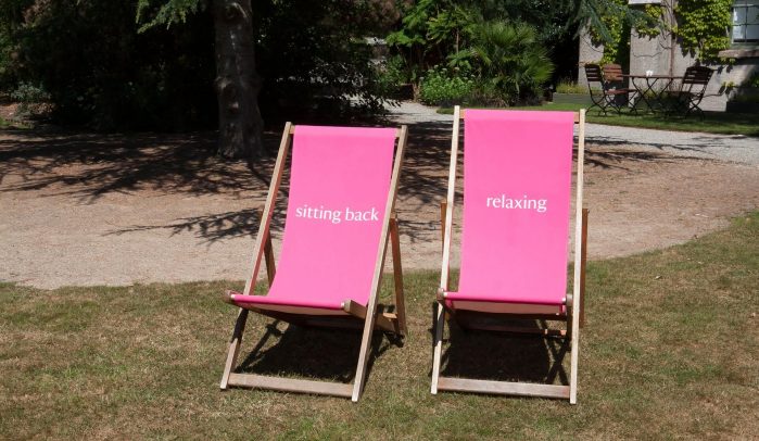
Is your website bone idle?
Is your website sitting back and relaxing when it should be working hard for your business?
Maybe it’s not working hard enough to attract visitors. Or it’s not working hard enough to keep the visitors you do get and convert them into customers.
Plenty of business owners I’ve spoken to have told me their website doesn’t work — or has never worked. While the businesses around them — including their competitors — seem to be thriving online.
So what are they doing wrong? Or, rather, what are those other businesses doing right?
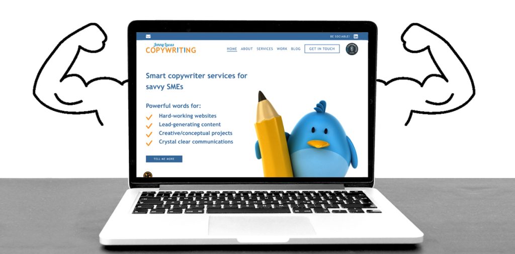
Your website should be your hardest working employee
Your website is always online, giving potential customers 24/7 access to your brand. It should be attracting your ideal customers. Greeting them, showing them around your site, answering their questions and converting them into new business.
When a website does those things, it pays for itself. And it takes pressure off you, giving you more freedom to focus on the elements of your business that only you can handle
But what if it isn’t doing those things?
What if it’s missing some of the key components that should be making it work hard for you?
And what if that’s impacting its performance — and your business?
5 Signs your website isn’t working hard enough
Are you noticing any of these five key signs?
- You’re not getting enough visitors
- You’re not attracting the right kind of visitors
- Visitors are leaving your site too quickly
- Visitors are not converting into subscribers and sales
- You’re spending too much of your time answering questions, explaining things and clearing up misunderstandings.
How to make your website work harder
Your website should should be primed with SEO keywords that attract the right kind of traffic. It should give an excellent, friction-free user experience. And it should feature helpful content that demonstrates your experience and expertise, builds your authority and gains your visitors’ trust.
20 Secrets for website success
Here, I’ll show you 20 essential components of a hardworking website that pulls its weight, saves you time and earns you more money.
These are things that should be happening on the pages and under the bonnet.

1. The right SEO keywords
Using the right Search-Engine-Optimised (SEO) keywords on your website will help to attract your ideal customers.
The keywords on your website should correspond with what your ideal customers are typing into Google. And when they search for those keywords, they should find your site in the search results.
If you haven’t had your website optimised by an SEO professional, you could be missing out on valuable traffic.
2. Fast loading speed
A hardworking website should load in as short a time as possible — ideally immediately, but, more realistically, in 2 seconds or less.
And if it doesn’t?
You could be losing visitors before they’ve even arrived.
Because when people click a link to your website and it doesn’t load fast enough, they won’t sit around waiting for it. They’ll get impatient and go elsewhere.
The experience of landing on and using a website should be frictionless. If there’s a lag when it first loads, it gives a poor impression of how the rest of the site will perform.
3. Responsive design
Responsive design means a website will automatically resize to fit whatever device it’s viewed on — whether that’s a desktop, laptop, tablet or smartphone. And the user experience should be seamless, whichever device you’re using.
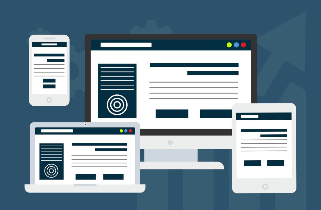
It’s unusual to see a website that doesn’t have a responsive design these days. But the quality of the user experience can vary from one device to another.
If your mobile site has a low engagement rate compared to your desktop, that could mean your mobile isn’t giving such a good user experience.
And considering, as of May 2026, the market share split was 51.04% mobile compared to 48.96% desktop, that’s something you may want to look at.
4. The right information in the hero section
The hero section, also known as the area ‘above the fold’, is the top portion of your landing page. This is the first thing your visitors see when your site loads, so it’s important it gives them all the information they need.
Your hero section should include:
- A clear and compelling headline
- A brief description of what you do and who for
- At least one benefit you offer
- Your value proposition.
You might also include your:
- Review site rating e.g. Trustpilot, Tripadvisor
- Professional membership logos
- First Call to Action or Call to Value.
If you don’t give visitors this information as soon as they arrive, they might presume your website isn’t where they should be looking.
5. Strong, recognisable branding
Strong, professional branding always makes a good impression. And this should be carried across all your marketing materials. From your business stationery to your signage, vehicles and packaging — and, of course, your website.
Strong branding is all about consistency. Consistent colours, fonts, and graphic elements. Consistent messaging and tone. Across every webpage and facet of your brand.
If a visitor comes to your website having seen your branding out in the wild, this familiar aesthetic and messaging will be what convinces them they’re in the right place.
6. Familiarity and intuitive design
Websites have evolved considerably over the last three decades.
In the early days they were experimental, but we’ve learned some lessons since then. Today, they mostly follow a similar structure with the layout and pages people expect to see. This makes using them feel like second nature.
One of the benefits of hardworking websites is that they don’t have a learning curve. Visitors can arrive on the site and know intuitively how to use it.
They achieve this by having a familiar-looking:
- Sitemap
- Navigation menu
- Page structure
- Set of buttons and controls.
7. Clear navigation and signposting
Visitors can find their way around a hardworking website quickly and easily. The navigation is clear and the signposting is well-considered, giving them the right choices and direction at each stage of their visit.

Making it easy for your visitors to find the information they need is crucial for keeping them engaged.
Here are some ways to improve your navigation and signposting:
- Give your pages relevant, meaningful and familiar names
- Include links to other relevant content where appropriate
- Use contrasting coloured buttons for important links
- Introduce your other pages with explanatory text
- Categorise and tag your blog posts
- Include a site-search feature.
8. Compelling copy
Hardworking websites are written in a compelling way that’s designed to intrigue and engage your readers.
Examples of the techniques copywriters use include:
- Attention-grabbing headlines
- A conversational and easy-to-read style
- Relatable descriptions of the problem
- Storytelling and real-life examples.
This makes the copy enjoyable to read and encourages your readers to read more. The more they read, the more they learn about you and the more they’ll see you as expert, credible and trustworthy.
9. Regular blog content
Hardworking websites are regularly updated with fresh content, which satisfies a number of objectives.
It shows Google your website is active and happening place to visit. It helps to build an engaged audience at all stages of the customer journey. And it’s creating a valuable resource on your website, for visitors and SEO.
Read my article on the importance of posting new blog content regularly >>
10. Voice of Customer (VoC)
Voice of Customer (VoC) refers to the language your ideal customers are using. It’s the language they’re familiar with and are comfortable using in their day-to-day life. The language they use to describe things and the language they use on search engines.
Hardworking websites use this language to meet your ideal customers at their level.
It helps them find you online and understand your content. This means you can take them through your customer journey, educate them about your products/services and give them the information they need.
11. Clear, customer-focused copy
Hard-working websites focus on your ideal customer and on delivering a clear message to them. They do this by acknowledging your ideal customer and addressing them directly. This means much more ‘you’ and ‘your’ and much less ‘we’, ‘us’ and ‘our’.

Your ideal customer should be at the heart of your website. With copy and content that’s created for them and speaks to them — in a way that’s relatable and resonates.
Clarity is vital in any written communications — and especially on your website. Because if something isn’t clear, there’s no one on hand to explain it.
Read my article on how I write copy that focuses on your ideal customer >>
12. Optimal formatting
People don’t read websites — they skim them. Hardworking websites are written with this in mind, with well-formatted, easy-to-consume copy and content.
How do you make content easy to skim?
By using:
- Relevant headings to introduce each new section
- Short paragraphs surrounded by lots of white space
- A clear typeface at an optimal size for the screen
- Optimal line spacing and paragraph spacing
- A varied format with:
- Visuals
- Call-outs
- Bullet points.
13. Trust signals
A hardworking website will convince your visitors you’re:
- A genuine, professional business
- An expert in what you do
- Selling valuable products/services
- The business they want to buy from.
Here are some ideas on how to achieve that:
- Have a professional and functional web design
- Display your business address — and landline, if you have one
- Use social proof (see point 15)
- Post authoritative and expert blog content
- Be verifiable off your website with:
- Social media links
- A Google Business listing
- Independent review site ratings
- Professional membership profiles.
14. Accessibility for all users

Some of your ideal customers may have disabilities and impairments that can make it difficult to read and navigate your website.
Hardworking websites value all their visitors, providing an accessible and inclusive user experience.
How can you make your website more accessible?
Here are some tips:
- Allow readers to increase the font size
- Organise your content well, with relevant headings to help screen readers
- Avoid using tables to lay out your page as this can confuse screen readers
- Use alt text on integral images to describe what is being shown
- Give links descriptive names that explain where they will take the reader
- Use contrasting and easily distinguishable colours
- Make forms accessible so readers understand what information to enter
- Include keyboard navigation for those who can’t use a mouse or trackpad
- Include subtitles on your video content.
15. Social proof
A website needs to work hard to establish trust.

One of the reasons people trust what they’re being told is because it’s reaffirmed by others. On a website, this usually reaffirmed by existing customers who’ve had a good experience with you and are happy to recommend you.
This is what’s known as social proof.
You can demonstrate social proof on your website by including:
- Case studies
- Testimonials
- Independent review site ratings e.g. Trustpilot, Tripadvisor, Yelp, Google
- Links to testimonials on LinkedIn and Facebook.
16. Helpful blog content
People use Google for all kinds of searches. Hardworking websites respond to those searches by giving people exactly what they’re looking for.
That could be:
- Answers to their questions
- Solutions to their problems
- Tutorials and how-tos
- Ideas and inspiration
- Research and information.
You can also create blog posts that give answers to your own FAQs. This will save you time answering the same questions over and over again, when you could be doing something more productive instead.
Google’s Helpful Content Update rewards content that genuinely helps people and hasn’t just been created for search engine rankings. Original content that shows first-hand experience and expertise is particularly valuable.
Your blog also gives you a golden opportunity to rank for more keywords and attract more visitors — if you use it correctly.
Read my article on how blogging works for your business >>
17. Effective Calls to Action (CTAs)
A CTA is a prompt for your user to take an action. That action might be to follow a link, to contact you or to buy something.
Effective CTAs are clear and descriptive, so users know exactly what to expect. They’re displayed at the perfect time, when the user is ready for them. And they take the user to the correct page or process, with seamless continuity and no broken links or dead-ends.
To make the CTA even more effective, you can introduce it with an enticing text description.
The description can change a simple CTA into a Call to Value (CTV).
What is a call to value (CTV)?
A Call to Value is a CTA with benefits — literally. Because with a CTV, you explain the benefits of taking the action.
You can see the difference in these examples:
CTA: Start your free trial
CTV: Start your free trial now and start streaming your favourite series today.
CTA: Sign up to our mailing list
CTV: Sign up now and start getting more business from LinkedIn, with daily tips straight to your inbox️.
CTA: Buy now
CTV: Buy now for instant peace of mind.
Read my article on 10 ways CTAs can kill your conversions >>
18. Friction-free processes
If a user is going through one of your processes, this means they’re taking action. That could be subscribing to your email list, signing up for a free trial, submitting a contact form or making a purchase.
On hardworking websites, the vast majority of these actions result in the desired outcomes. This is because those processes are smooth and simple — with no friction or sticking points.
Friction can be caused by poor instructions, a faulty process or an unexpected curveball.
For example, it could be that:
- The process is confusing and not straightforward
- The wording is confusing and/or ambiguous
- The process has stopped working properly
- An unexpected cost has been added
- Too much information has been requested.
To avoid problems like these:
- Use familiar and intuitive processes and language
- Test your processes and forms regularly
- Use clear and effective micro-copy
- Give users the information they need upfront to avoid nasty surprises
- Only ask for the information you really need.
19. Easy-to-use forms and sign-ups
If you want users to sign up or contact you, it’s important to make this as easy for them as possible.
Make your forms clear and accessible
Users should understand exactly what they need to do.
Only ask for necessary information
You should only be asking visitors for the information you need to deliver what they’ve asked for. For example, if they’re signing up to your marketing emails, all you should need is a first name and email address.
Asking for too much information can make your visitors think twice and may be against GDPR rules.
Be sure to include a ‘thank you’
When your visitor has submitted a form, a thank you will confirm the form was sent successfully.
If users are in doubt, they might feel they have to go through the whole process again, causing frustration and annoyance.
20. Clear contact information
You can make it easy for users to contact you by:
- Giving a choice of different contact options
- Having a calendar they can book onto
- Including your working hours/days on your contact page
- Letting them know when they can expect a response
- Using an out-of-office notification if you can’t respond in that timeframe.
Want to get your website working harder?
Maybe I can help.
I’m Jenny Lucas, a freelance web copywriter and content writer based in Leicester, UK.
I’ve been using websites daily since the 90s, I’ve built several websites from scratch and I now specialise in writing high-performing SEO copy and content for websites and blogs.
I also offer website troubleshooting for problem websites that aren’t doing what they’re supposed to.
Need some help to transform your website into the lean, mean, lead-generating machine it should be?
You can find out more about me and the services I offer:

You might also like…