UPDATED APRIL 24, 2026
Is bad website design killing your business?
As a freelance copywriter and content writer, I spend a large proportion of my time on the internet. And some of the websites I see are shocking.
There are all kinds of reasons why a bad website could be harming your business — from painfully slow loading and broken links, to copy that doesn’t hit the spot.
But in this article, I’ll be looking specifically at bad website design. The kind of design that frequently makes me want to leave a page immediately and find something less offensive to look at.
Why bad web design happens
Bad DIY web design
Some of the bad website designs I see are DIY jobs.
Designing your own website is easier now than it’s ever been, with a variety of platforms and templates available. But not everyone has an eye for design and this is glaringly apparent when they publish their creations.
Professional web designs gone wrong
Some creative projects can be difficult.
Clients might insist on visions or changes that a web designer would never advise.
Sometimes there’s tension in the working relationship that leads to unresolved issues and parts of the website left unfinished.
And sometimes bad things happen when clients try to manage their own content and get it wrong.
Why bad website design is harmful
Studies have shown that it takes less than two tenths of a second for visitors to form a visual first impression of your website. And that first impression will likely determine whether or not they choose to stay.
That means you have about 0.2 seconds to make the right impression with a design that:
- Is on-brand and visually appealing
- Looks professional and polished
- Shows you care about your visitors’ experience
- Draws visitors in and makes them want to see more.
A design that’s ugly, looks amateurish or gives a bad user experience could be repelling your prospects and turning them away.
15 Cringeworthy web design mistakes
Disastrous distractions
1. Crazy clutter
Some websites have so much going on, you don’t even know where to start.
Take Ling’s Cars, for example. Yikes.
Ling’s Cars
Ling’s first claim to fame was when she was on the BBC’s Dragons’ Den, looking for an investor for her business.
Since then, she’s probably more famous for her websites.
The screenshot below was from around 2017, when her website was infamous for being one of the most cluttered websites the world had ever seen.
They say all publicity is good publicity… but, still.
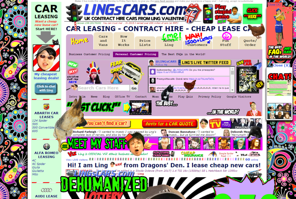
Absolute chaos. And you can’t even see the wild animation or hear the autoplay music. You must be so relieved about that.
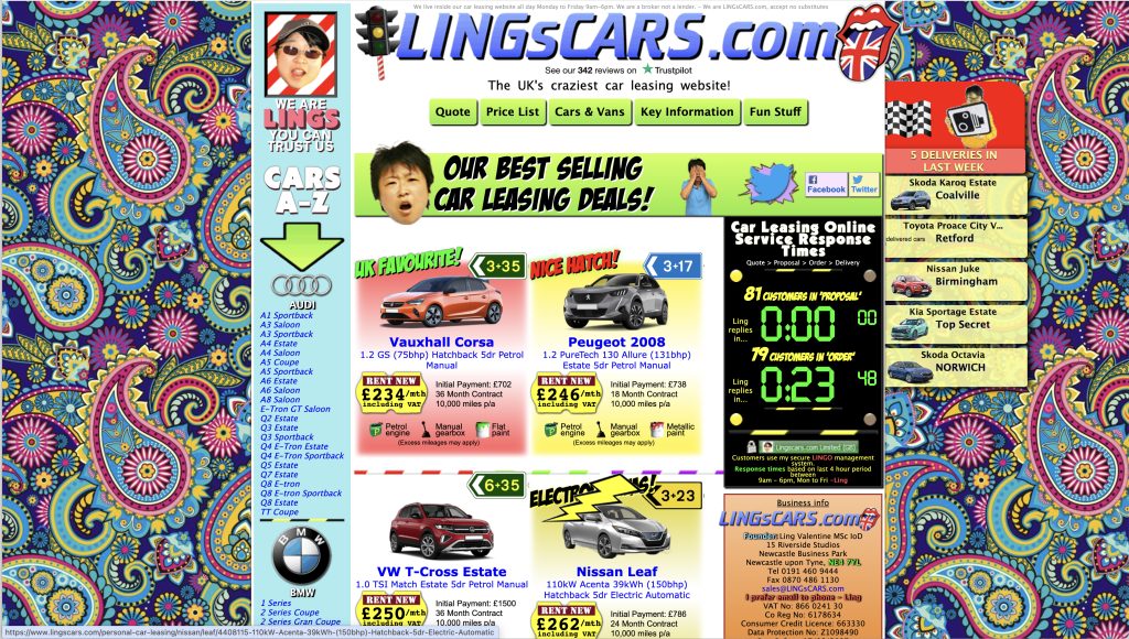
By 2024, she’d toned it down a bit — although there was still some animation on here. But there are still so many links, buttons and interactive elements. And they pull your attention in so many directions, you feel like you can’t focus on anything.
In 2026 the site has been transformed. It still has the quirky personality, but the clutter has all gone. You can see for yourself at LingsCars.com.
Gates N Fences
The screenshot below is from the website of a Miami company called ‘Gates N Fences’.
And, if you can believe it, the website still looks like this in 2026.
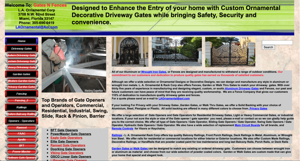
When I designed my first website in 2010, this three-column format was popular. At that time, responsive design wasn’t a thing and most people were still browsing on computer screens.
Most modern websites have a much simpler one-column format. They start with a large heading that immediately draws the eye, then have body copy interspersed with more headings and calls to action as we scroll down the page.
2. Pesky pop-ups
Pop-ups are generally an unwelcome distraction most website visitors can do without. They’re often large, covering a significant part of the screen, and can be difficult to close down.
They can be annoying, too. Because how can you decide if you want to sign up for emails before you’ve had a chance to see what the company does?
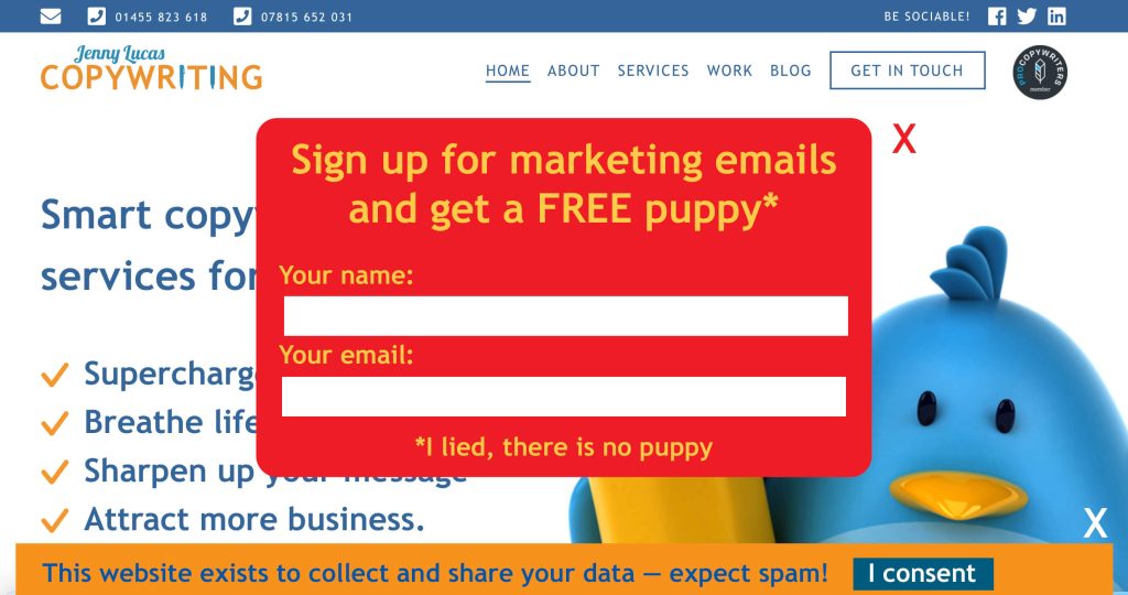
If you must use a sign-up pop-up, have it set to appear when your visitors are leaving rather than when they arrive. Then at least they’ll have had the chance to decide if they want to sign up.
Text crimes
3. Frightful font choices
When I designed my first website, there were only five web fonts to choose from. Now there’s a much wider choice, but this isn’t necessarily such a good thing.
On some websites, the fonts are chosen for creativity rather than readability and that can cause problems.
Let’s look at some examples:
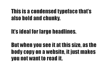
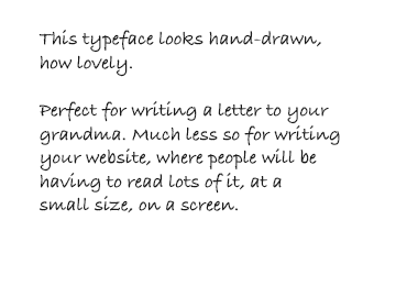
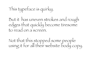
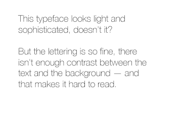
How to choose a better font for your body copy
The font you choose should:
- Be legible and easy to read on a screen — even at a small size
- Look professional and businesslike.
Most body copy fonts are either serif or sans-serif.
Serif means the font has serifs, which are little line details on the letters.
Sans-serif means without serifs.
Here’s an example showing the serif and sans-serif version of the same font. On the serif font, you’ll notice that capital A has the little line details on its feet. On the sans-serif font, these line details are missing.
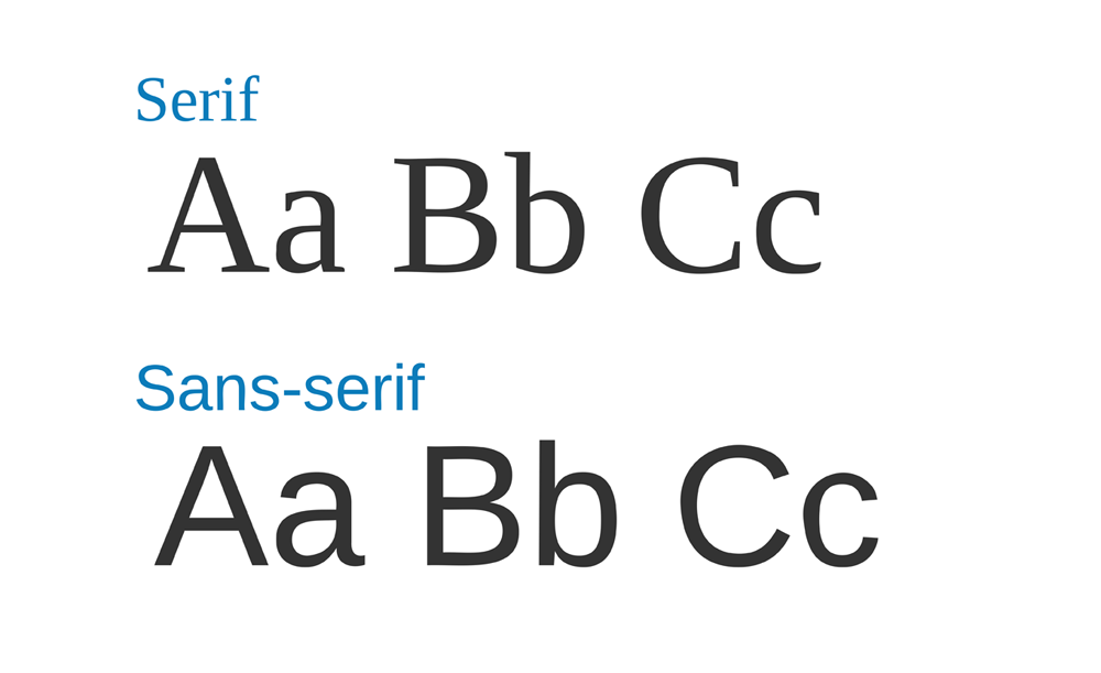
For websites, sans-serif is more widely recommended, because these fonts are cleaner and easier to read on a screen.
If you want to be more creative with your font choices, use the more creative fonts for your headings, which are generally larger, shorter, and will be less problematic.
4. Too many fonts
Almost as bad as using the wrong font, is using too many fonts.
Too many fonts on the same website looks chaotic. It’s confusing, distracting and doesn’t give an impression of a confident, cohesive and well-thought-out brand.
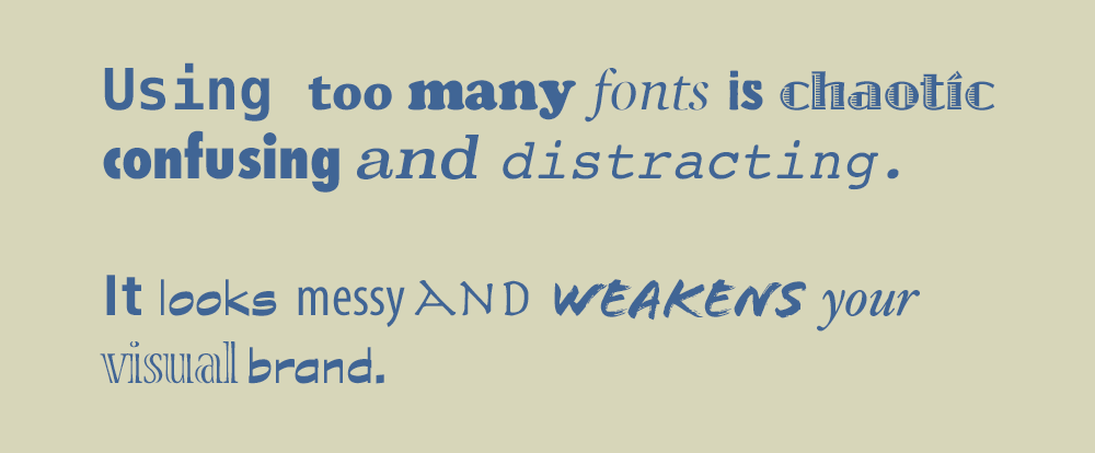
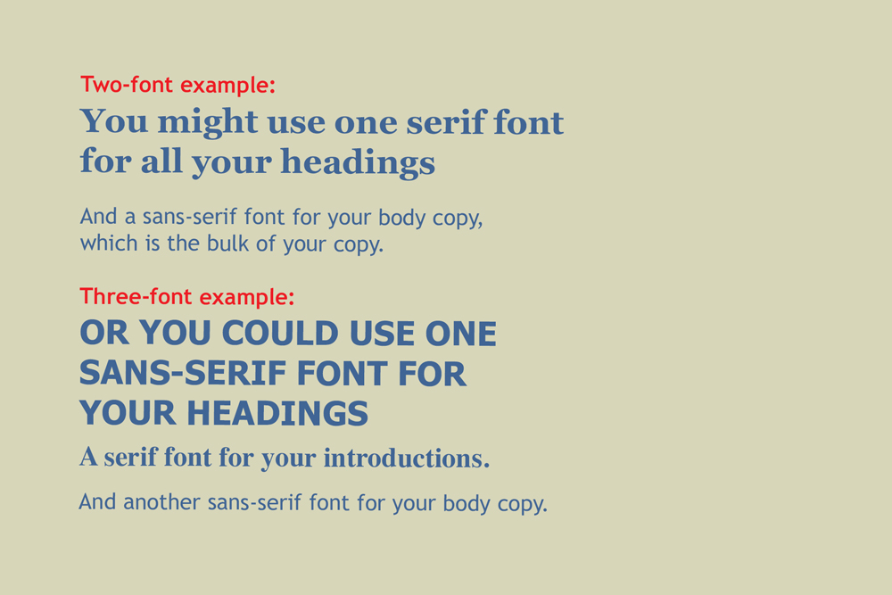
Ideally you should aim to stick to one or two fonts — three at the most.
Here are a couple of examples of how to use them:
Catastrophic colours
5. Poor contrast
Reading on a screen is more difficult than reading a paper — and even more difficult if you get the contrast wrong.
You need to make sure there’s a good contrast between your text and background, so the text stands out.
Let’s look at these examples:
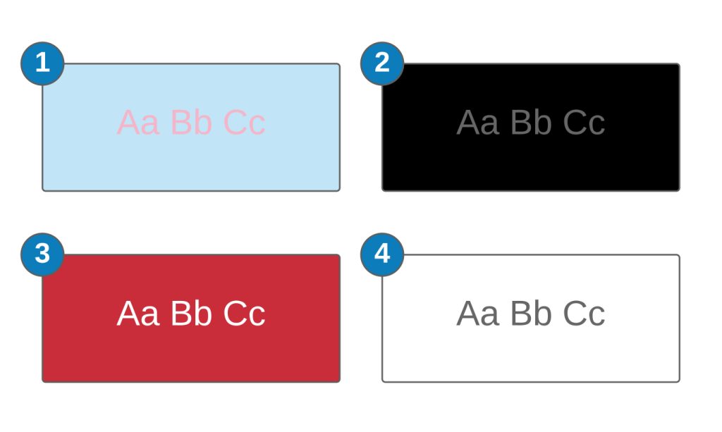
- Pink text on blue is popular, especially with baby brands, but it’s nauseating. Often the blue and pink are brighter and more vivid than this. It’s unpleasant to read and off-putting to visitors.
- The black and grey combo might look cool and sophisticated, but the contrast is poor, which makes it difficult to read.
- Choosing a bold background colour, like red, and adding white text makes a statement. The contrast here is good but it’s not necessarily pleasant to read a whole website from, so if you’re going to do something like this, do it more sparingly.
- You can’t go wrong with dark text on light background. Yes, lots of other websites do it, but that’s because it works and it’s comfortable for most people to read.
6. Busy backgrounds
A striking image can make a bold statement on your website, but you need to choose carefully.
If you place your text over something busy, you might find it becomes camouflaged or disappears completely.
Even if your design looks okay on a desktop, a responsive design can cause things to move around on smaller devices.
In this example, there’s so much going on in the background, it’s hard to read the copy.
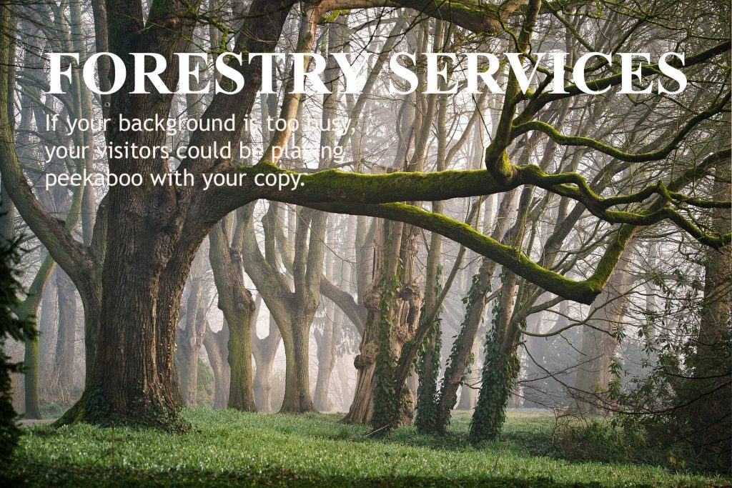
In this example, the picture has enough clear space for the text. But you need to make sure it still works when the text repositions for different screen sizes.

Formatting failures
Common mistakes happen in the formatting of the copy.
Here are the things you need to avoid and what to do instead.
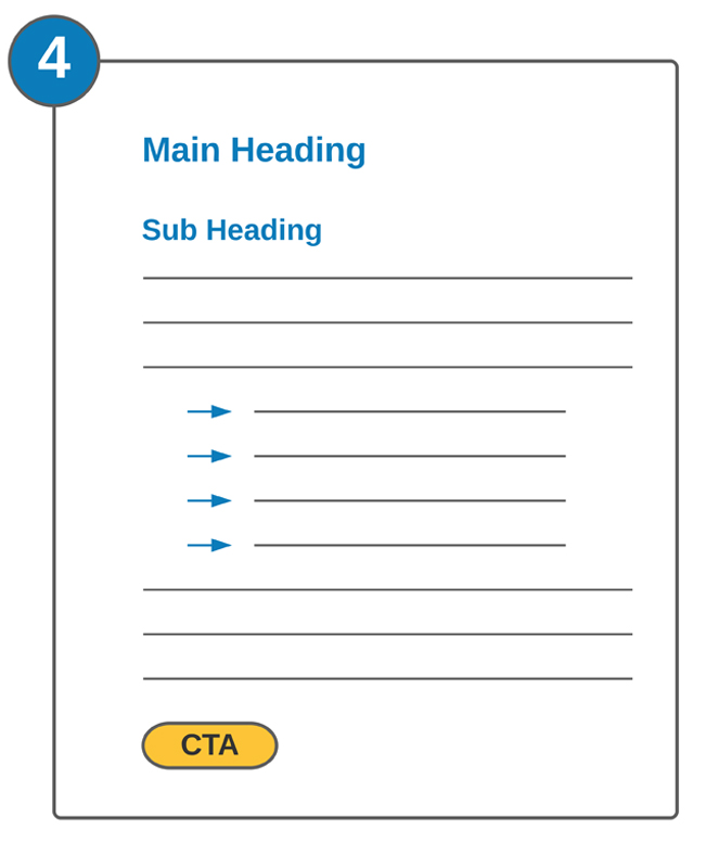
7. The impenetrable wall of copy
Too many websites are formatted like this: a heading followed by a wall of solid copy with no paragraphs or breaks. This might be acceptable in a book, but on a screen it can be really off-putting.
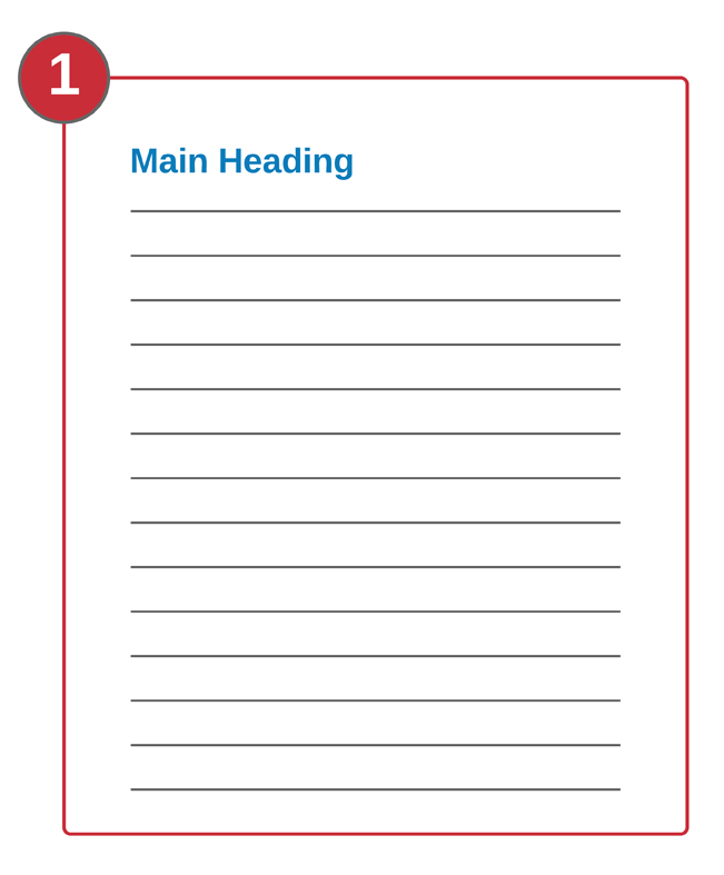
Varying the format will break up the copy and add white space to improve readability.
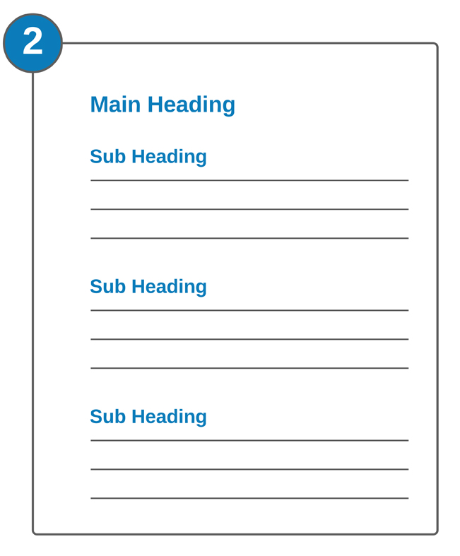
Use short paragraphs and add headings
The best way to make visitors want to read your copy is to make it look more appealing.
Split it into short paragraphs and use relevant headings and sub-headings to introduce each section.
Use call-outs
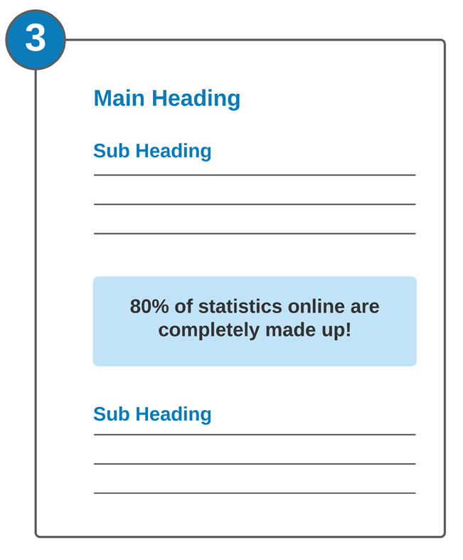
Another way to break up the text is to use call-outs to highlight important information.
A call-out is a section of larger text with an important statistic or interesting quotation.
Use bullets and CTAs
Bullet points help to break up long lists and sets of related points.
A CTA, aka a Call To Action, is usually in the form of a button or link that takes the visitor on the next phase of their journey through your website. That might be to go another page of your site, to make a purchase or to get in touch with you.
Your CTAs should be carefully considered and well placed for maximum conversions. For more information on this, check out my article on 10 Ways calls to action can kill your conversions >>
8. Alignment issues
There are three ways to align the text on your website: to the left, to the centre and to the right.
Left-aligned text
Left-aligned text is the easiest and most
comfortable to read. This is because we
read from left to right and each line is
starting from a fixed point at the
left-hand margin.
This is the way books are aligned and it
feels the most natural of the three.
Centre-aligned text
Centre-aligned text sits in the centre of
the space and isn’t fixed to either margin.
Each line of text starts from a different
point on the left, creating a staggered
effect, which can be harder to follow.
Right-aligned text
Right-aligned text anchors itself to the
right-hand margin, which creates the
same staggered effect and pulls your
eyes to the right.
Centre and right-aligned text can be harder and more tiring to read, so, if you’re using them, it helps to use them more sparingly.
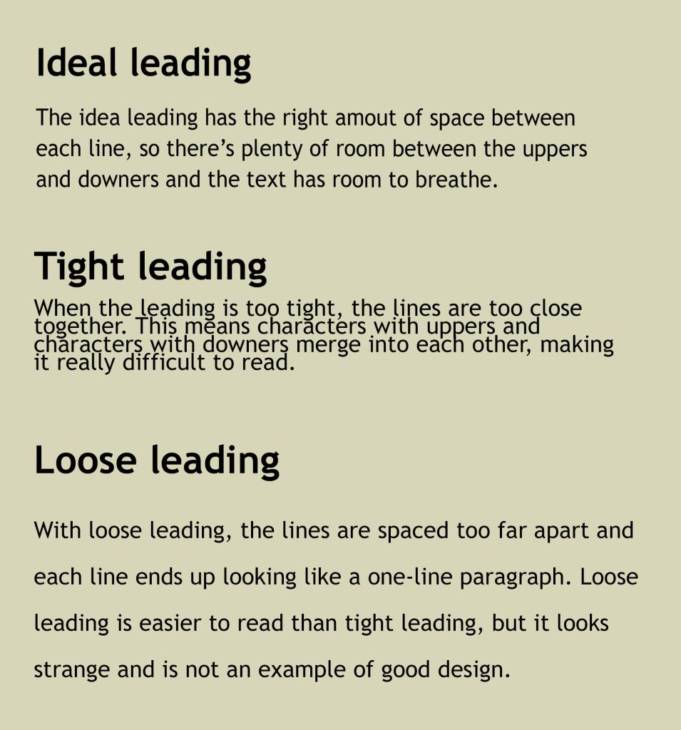
9. Illegible leading
Leading (pronounced ledding), essentially refers to the amount of space between each line of text in a paragraph. Getting this right means your text is easy to read and looks right on the screen.
Some lower case characters have what we call ‘uppers’ and ‘downers’. These are the parts of the letter that stick up or hang down.
Characters with uppers: b, d, f, k, l, t
Characters with downers: g, j, p, q, y
If the leading is too tight, the uppers and downers will touch and the text will be difficult to read. If it’s too loose, it can look wrong.
To show you what I mean, here are some examples:
10. Borderless content
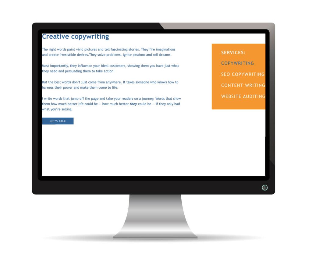
Some apps and templates require you to set up your own borders. If you don’t do it correctly, you get a website that looks like this, with copy that goes right up to the edge of the browser window. This is a sure sign of an amateur, so it’s something you really want to avoid.
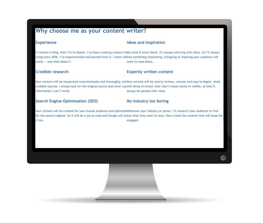
If you’re using a two-column format with no borders, your text can crash in the middle, making it unreadable — as shown in the example below.
11. Shifting styles
Most websites evolve over time. Administrators change, new pages are added and — unless you have an effective Cascading Style Sheet (CSS) in place — existing styles can evolve too. Fonts, colours and styles change from one page to another.
Sometimes what you’re left with is a Frankenstein’s monster of a website where there’s no consistency or sense of cohesion. This can be jarring and confusing for your audience.
If you can’t establish an effective CSS, it might help to create a style guide that all your website administrators can refer to. This would include:
- Heading fonts, sizes and colours* (for H1, H2, H3 etc)
- Body copy font, size and colour*.
*Use the web colour code, which is 6 characters preceded by a hash, e.g. #336699.
Perplexing pictures
The images on your website can create a misleading impression of your business that makes you look cheap and amateurish. There are several things to watch out for here and I’ve reworked my homepage into a handy example that shows most of them.
12. Rough cutouts
Let’s start with the very top of the screen, which looks sloppy and unprofessional.
If your logos and other graphics are saved with white backgrounds, it makes sense to put them on a white background, so you can’t see the white edges and corners.
You should also make sure your icons are all the same size and that the colours you’re using are consistent with the other elements on the page.

13. Irrelevant images
I’m a sole trader who’s not a great fan of formality, so this image, showing a team of business executives around a boardroom table, is a million miles away from what my business actually looks like. Using an image that misrepresents your business like this can come across as fake.
The written and visual elements of your website should work in a unified way to clearly communicate who you are and what you do. So, when choosing images for your site, try to stick to pictures that are authentic, genuine and relevant.
14. Talkin’ bout resolution
Pay attention to the resolution of the images you use and make sure they’re good quality and web-friendly.
Low-res images, like the one in the example, are poor quality and will appear blurry and pixelated. But high-res images have larger file sizes and can slow down your website.
You need to take the high-res versions of the images and optimise them for the web. Optimising allows you to reduce the file size without any noticeable reduction in quality.
When I optimise my images, I first make sure the resolution is set to 72 dpi, to make them web friendly, then compress them further using Tiny PNG.
15. Watermark warning
The © sign you can see across the centre of the photograph is called a watermark. You get watermarks like this if you’ve used a low-res composition version of a chargeable stock image. You have to pay for image to get the high-res unmarked version.
I can’t tell you how many websites I’ve been to that have these low-res watermarked images in place.
The first impression this creates is either that you’re cheap, because you haven’t paid to download the proper image. Or that you’re sloppy and careless, because you’ve left the watermarked image in place and seemingly haven’t noticed.
A handy recap
This article has given you 15 cringeworthy examples of bad website design. So, here’s a recap of the good advice you can take from this and apply to your own site.
- Avoid clutter and use plenty of clear/white space
- Stick to a simple single-column design
- If you must use pop-ups, set them to appear when your visitor is leaving your site rather than when they arrive
- Choose clear, legible fonts that are easy to read on a screen
- Stick with one or two fonts — three at most
- Using dark text on a light/white background gives you the best colour contrast for easy reading
- If you’re using a photo or pattern as a background, make sure it’s not too busy and has enough clear space for your text to sit on top
- Split walls of copy into paragraphs with white space between them
- Use headings and subheadings to guide the reader through the text
- Left align your text for easier and more natural reading
- Make sure the leading on your text looks right and not too tight or loose
- Set borders on your pages to keep your text away from the edges
- Use fonts, colours and layouts consistently — especially when adding new pages to your site
- Make sure like elements, such as icons, are all the same size and colour
- If you’re using stock images, make sure they feel authentic and relevant to your business
- Make sure your images are high-res and optimised for the web
- Download any chargeable images so you get them at the best resolution and without the watermark.
You might also like…


Having problems with your website?
I’m Jenny Lucas, a freelance copy and content writer specialising in websites. I’ve been using websites since 1995 and have built and written several of my own websites from scratch.
If your website isn’t doing what it’s supposed to — i.e. making you money — and you’d like to find out what’s wrong, maybe I can help.
With an objective, expert pair of eyes, I can usually spot the problems and give you the practical advice you need to fix them. So you can turn your website into your hardest working employee — attracting your ideal customers and converting them into paying customers.
If you’d like my help, send me a message and tell me about the problems you’re having.

