
UPDATED SEPTEMBER 3, 2025
What is a call to action?
A call to action (CTA) is any point on your website where you ask your visitors to take action.
Examples of CTAs might include:
- Subscribe to our mailing list
- Book a discovery call
- Get your free trial
- Find out more
- Sign up here
- Add to cart
- Buy now.
Your CTAs are the parts of your website that result in sign-ups, sales and enquiries, so getting them right is crucial.
10 CTA conversion killers
Are you making any of these common CTA mistakes and ruining your chances of converting?

1. Not being obvious enough
Some CTAs are so subtle and understated, they’re barely noticeable and it’s easy to scroll past them without clicking. If this sounds like your CTAs, that could be why they’re not converting.
Your CTAs should be clear, obvious and unmistakable, so your visitors can’t miss them. Use good design and contrasting colours to make them stand out.
2. Missing your chance
Website visitors generally don’t read web pages from top to bottom. In fact, they read very little at all.
Studies show that during an average website visit, website users spend an average of 54 seconds on a web page and will read about 20-28% of it.
If your only CTA is near the bottom of your page, chances are, most of your visitors aren’t even scrolling down that far.
Throughout your page, you need to gauge when your visitors will be ready to take an action. Then give them the opportunity to take that action with a clear and appropriate CTA.
3. Expecting too much, too soon
You wouldn’t propose marriage on a first date, so you shouldn’t assume your visitors are ready to engage with you before they’ve got to know you.
In other words, you should be careful about what you’re asking your visitors to do and when you’re asking them to do it.
To make sure you’re not asking for too much, too soon, you should use a mix of soft and hard CTAs.
What is a soft CTA?
A soft CTA is typically one that furthers your visitors’ experience, but doesn’t require them to commit to anything.
For example:
- Read more
- View services
- Browse products
- Get a free quotation
- Start a free online trial.
Soft CTAs can be used anywhere on a web page.
What is a hard CTA?
A hard CTA is an action that requires a commitment from your visitors.
For example:
- Buy now
- Contact us
- Add to basket
- Create an account
- Book a strategy session.
Hard CTAs can be used when you’ve sufficiently demonstrated what you can do for your prospects and the value you’re providing.
4. Not being relevant
Let’s say a pet store interrupts a web page about dog grooming with a CTA to purchase cat toys. Or a construction company interrupts a web page on home extensions with a sign-up box for a newsletter on garden sheds.
In both cases, the CTA is completely off-topic and irrelevant to the content on the page. This only confuses visitors, as it isn’t relevant to them. The result is that they don’t take action and the CTAs don’t convert.
Your CTAs should be relevant and applicable to the content they’re placed in.
5. Having too many CTAs
Too many CTAs on your web page can seem desperate. It’s also likely to overwhelm your visitors, so they don’t know what to click on or which action they should take.
6. Not being clear or specific
Visitors are naturally wary of clicking on anything they don’t understand or don’t feel sure about.
If your CTAs are confusing or vague and your visitors don’t feel confident, chances are they won’t take any action.
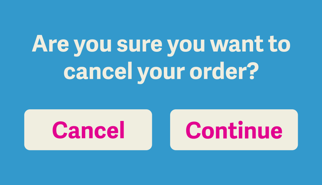
The illustration below shows a CTA that’s confusing and would leave visitors feeling unsure. If you did want to cancel your order, which button would you click?
Similarly, vague CTAs, like click here will leave your visitors faltering because they don’t give them enough information to make a decision.
Your CTAs need to be clear, simple and specific, leaving visitors in no doubt about what will happen when they take the action and what they should expect.
7. Not explaining the benefits
If your visitors don’t understand how taking an action will benefit them, there’s no reason for them to take it.
When taking an action will result in a direct benefit for your visitors, you need to explain it.
A CTA that demonstrates a benefit is also known as a Call to Value.
For example:
❌ Join our Members’ Club today.
✅ Join our Members Club today for exclusive discounts, early access to our seasonal sale, and a free gift worth £25.
❌ Subscribe to my list and get a free planner.
✅ Subscribe to my list and get a free planner with daily content prompts.
8. Delivering something unexpected
When you’ve gained your visitors’ trust and convinced them to take an action, the last thing you want to do is surprise them with something that makes them think twice.
For example:
- Adding an unexpectedly high delivery charge at the checkout
- Linking to a landing page that seems odd or has no continuity
- Using a sign-up that asks for too much personal information.
To avoid these scenarios, you need to manage your visitors’ expectations as they go through the process. Make sure you’re being consistent with your language and imagery, and avoid doing anything that might give them second thoughts.
You can read more about landing pages here: How to create the perfect landing page >>
9. Having mobile issues
It’s likely that a proportion of your visitors will be looking at your website using mobile devices — and using their fingers to navigate it.
On a mobile, you can’t identify links by hovering your cursor until it turns into a hand. Your CTAs need to be obvious, so mobile users can click them with confidence. I’m talking large buttons in a contrasting colour and labelled with a crystal clear instruction.
Similarly, completing sign-ups on a mobile can be awkward, so make this as easy as possible and require as little information as possible.
10. Having a broken process
Your website platform is always changing and evolving behind the scenes, with upgrades and bug fixes.
Sometimes these changes can result in links being broken or buttons that stop working. And sometimes whole processes break down, leaving visitors stuck in a loop.
They might be entering information that doesn’t submit — or doesn’t tell them it’s been submitted. Or trying to access the next blog post in a content hub only to find the link doesn’t work.
So it pays to go through the site routinely and check the functionality of your:
✅ Links
✅ Sign-up forms
✅ Contact forms
✅ Buying process.
Is your website working well?
If your website isn’t attracting enough visitors or converting your visitors into customers, there’s always a reason why.
I’m Jenny Lucas, a freelance SEO copywriter and website specialist who can help you find out where the problems are.
My comprehensive website audits are a fraction of the cost of a new site and will help you get your existing website working for you and bringing in those sales and enquiries.
If you’d like to find out more, visit my website auditing page or send me a message.

You might also like…