
UPDATED JULY 15, 2024
Website pop-ups are divisive
Most people I speak to hate website pop-ups with a fiery passion. But others insist they work and encourage website owners to use them to increase their conversions.

The downside of website pop-ups
I’ve yet to meet anyone who doesn’t find website pop-ups intensely irritating. People I’ve spoken to say they close down every pop-up immediately, often without even reading it. And if there are too many they’ll leave the site altogether.
But this isn’t an issue confined just to the people I know. According to Statista, 45% of internet users worldwide, have ad blockers installed on their devices. And, at the time of writing, the keyphrase ‘How to stop pop-ups’ and its variations are still getting searched more than 2,500 times every month.
The upside of website pop-ups
To add balance to this argument, there are companies telling us website pop-ups work to increase conversions. And they even provide data to back up their assertions.
Like Optimonk, for example. In a survey of their users, they discovered an average pop-up conversion rate of 11.09%. But this increased to averages of:
- 42.35% in the highest performing pop-ups
- 17.12% in the case of cart abandonment pop-ups
- 11.88% for seasonal offers.
The cart abandonment pop-ups performed better when there was an incentive, like free shipping or a 10% discount. This pop-up appears as the visitor is about to leave the site — so when it converts, it’s actually rescuing the sale.
In another study, Wisepops noted that, on average, email popups converted 4.01% of website visitors.
Why visitors find website pop-ups annoying

So what can we learn about website pop-ups from the people who dislike them so much? And can we use what we learn to make our pop-ups less annoying and more effective?
Let’s start by having a look at some of the reasons website visitors find pop-ups so irritating.
Poorly timed and/or irrelevant
Most pop-ups are timed and they seem to appear when visitors have just landed on a website and haven’t had a chance to see or read anything.
Unless your company is a well-known brand, there’s a good chance your website visitors don’t know anything about you. They don’t know if they want to buy your products. They don’t know if your service is right for them. They don’t know if the content they’re about to consume will be valuable.
At this point, a pop-up is often seen as an annoyance, because it has to be closed down before they can continue their user journey.
Intrusive and distracting
Most website pop-ups are intrusive. They’re overly large and appear in the middle of the screen, covering all the content. This means you’re forced to engage with them in some way — even if it’s just closing them down.
Now I know this is kind of the point, but it’s also why many people dislike them. Because they see them as disrupting the user experience rather than enhancing it.
On a smaller screen, like a mobile, tablet or laptop, the intrusiveness is even worse. Some websites aren’t even usable for people on these devices because the close-down button is beyond the edge of the screen.
Relentless and presumptuous
Some websites have a succession of pop-ups, one after the other.
There’s the cookie consent, then the confirmation of the cookie consent, the mailing list invite and the ‘helpful’ chatbot popping out to say hello. Then, as you scroll down, there are lead magnets, free trials and discounts.
For the visitor, this can feel like an onslaught.
For some people, one website pop-up is annoying. Show them this many and they’ll leave without buying anything.
Hard to close down
When an unexpected pop-up appears on the screen and the user doesn’t want to engage with it, their first instinct will be to tut loudly — there’s always a tut — and try to get rid of it.
But this may be easier said than done.
Because sometimes the X isn’t obvious or it doesn’t reveal itself straight away. And sometimes there isn’t an X at all, because the content is paywalled or only accessible to people who’ve created a free account.
If the only way to continue engaging with a site is to hand over your personal/payment details, many people just won’t bother.
Limited offer countdowns or fake scarcity
A visitor has just arrived on a website and is immediately confronted with a pop-up.
If they buy something in the next 15 minutes, they’ll get free shipping, a 10% discount or some other time-limited offer. And there’s a clock counting down the seconds until that offer runs out.
There’s nothing like a countdown timer to make a visitor feel rushed and pressured.
Even worse, if the visitor refreshes the page only to find the timer refreshes as well, meaning the limited offer was fake.
Autoplay videos
Pop-ups with autoplay videos are particularly intrusive and annoying.
In many cases an intrusive black box will appear on the screen. And, if the internet connection is slow, it can sit there for several seconds while the video loads.
If the user has their sound on, having a noisy video start up unexpectedly can be a shock. And if the user is at work, it could disturb them and everyone around them.
Video pop-ups are often hard to close down — and, even when the user does manage to close them, some just keep reappearing.
Confirmshaming opt-outs
What’s a confirmshaming opt-out?
Here’s a fictional example:
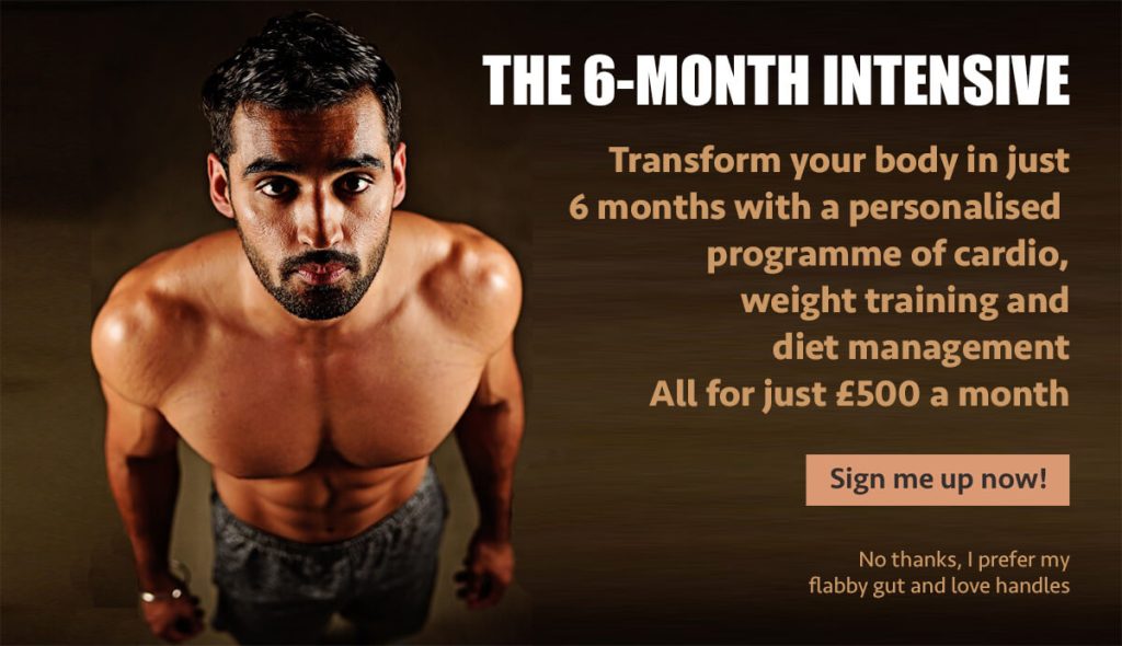
At the bottom of the pop-up, next to the ‘yes please’ option, there’s usually a less obvious ‘no thanks’ option. This is the opt-out.
But a confirmshaming opt-out won’t just say ‘No thanks’. It will probably say something snide like:
- No thanks, I prefer my unhealthy diet
- No thanks, I already know everything about…
- No thanks, I don’t want to be the best version of myself.
- No thanks, I like my wrinkles and age spots (or other flaw).
Opt-outs like these try to shame people into taking action, which is manipulative, unethical and likely to annoy them.
Malfunctioning or freezing
I was once on a website with multiple pop-ups that fired in a sequence as I scrolled down the page. The constant interruptions were incredibly annoying as I was interested in what I was reading.
I managed to close down the first few pop-ups, but the last one just froze in the centre of the screen. I couldn’t close it or scroll past it, so it killed my user experience dead.
If your pop-ups are malfunctioning like this, you can probably guess what it does to your user engagement and conversions.
Privacy concerns
Some people are intensely private and don’t like giving out their personal details to just anyone.
And some pop-ups ask for more personal details than they legitimately have a right to, such as birthdays, phone numbers and postcodes.
Asking for more information than you need will deter these people, even if they’re your ideal customers.
Using this insight to improve your pop-ups
Using the insights from the previous section, I put together this list of takeaways for creating better website pop-ups.
Consider your timings
Timed pop-ups often appear too quickly and don’t give readers time to get their bearings.
If you want to use a pop-up this early in the user experience, consider a pop-up that appears as visitors scroll down. This will, at least, give them time to read and explore a little, so they can:
- Make sure they’re in the right place
- Find whatever it was they came for
- Get a sense of who you are, what you’re offering and how you can help them.
Examples of early pop-ups that work
If you’re confident about what a large proportion of your visitors are looking for, you could use a timed early pop-up that links directly to it.
For example, you could create a pop-up that links directly to:
- Seasonal sales pages
- Products for an upcoming event, like Father’s Day
- Products that have recently appeared in popular media
- Well-publicised and popular service offerings
- Your most popular products — as indicated by page views or purchases.
What if visitors aren’t activating the pop-up?
💡 If lots of visitors are leaving a page before they start scrolling down, it would suggest they’ve realised they’re in the wrong place and your page isn’t delivering what they were expecting. If this is the case, you need to check where those visitors are coming from.
If they’re coming from a search engine results page (SERP), make sure your meta description is suitable and that the content on your page is matching their search intent.
If they’re coming from a link in a marketing email or social media post, make sure the description accompanying the link is correct.
Limit the number of pop-ups
If your website is throwing up a succession of different pop-ups, it will seem that you have no strategy and you don’t really understand what your visitors want or need.
It can also come across as desperate — and that you’re just trying everything in the hope that something sticks.
Try limiting the pop-ups you’re using at each stage and making more them relevant.
Which brings me on to my next point…
Make your pop-ups more relevant
To make your pop-ups more relevant, think about where your visitors are in their journey when the pop-up appears and what kind of pop-up would be most useful to them at that point.
For example:
- If they’re about to leave, but still have items in their basket, a pop-up to remind them could rescue the sale
- If they’re nearing the end of an article, a pop-up offering them further content by email might be of interest
- If they’re browsing products/services, or reading a buyer’s guide, a pop-up offering them a discount or a free trial might help seal the deal.
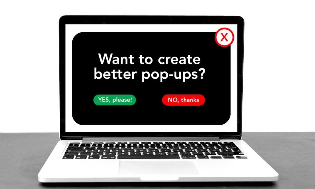
Make sure pop-ups are easy to close down
If your visitor is annoyed by your pop-up, they’re highly unlikely to engage with it and will want to close it down immediately. If you don’t make it easy for them, you could lose them altogether.
Have a clear ‘X’ close-down button in the top-right corner of the pop-up, where visitors will expect to find it.
And avoid tactics like delaying the appearance of the close-down button, hiding it in the corner or making it difficult to see. They will just irritate your visitor further and make them less likely to want to engage with you.
Avoid underhand tactics
Underhand tactics include creating a fake sense of urgency or scarcity to push for a quicker sale.
This pressures your visitor to act faster and it means they might not take as much care as they should over their purchase. It also means there’s a risk of them being unhappy with their purchase — which could be bad for you.
Using tactics like these will make visitors wary and less likely to trust your brand.
Take care with autoplay videos
Personally, I would never advocate using autoplay videos — either on a pop-up or on a website in general.
People like consuming video content, but if they’re going to watch a video, they want to be prepared. They want to know how long the video is before they start, so they’ll know if they have time to watch it. They might want to get a drink or a snack. They might want a chance to to plug in their headphones and open their notebook.
They want to make sure they’re paying attention. And you want them to be paying attention. But if you catch them off guard, they might just close your video instead.
Don’t be snide
Being snide with your visitors won’t win you any fans — and could even make your brand unlikeable*.
So it’s best to avoid confirmshaming and passive aggression in your pop-ups — and anywhere else.
If your visitor isn’t ready to commit, it will either be because they’re genuinely not ready or because you haven’t done enough to persuade them. And passive aggression won’t work in either case.
*Unless you’re one of those rare brands that uses snide humour successfully and has a devoted tribe of fans. But that doesn’t happen often.
Check your pop-ups regularly
If your pop-ups are freezing or malfunctioning, they’re definitely costing you customers. So it’s important to check them often and make sure they’re working as they should be.
You can check them by viewing your website in your browser’s private or incognito mode.
Only collect essential data
If your visitors have privacy concerns, these will only be heightened if your pop-ups ask for too much information.
So only ask for the minimum you need. For example, if you’re signing people up for an email list, a first name and email address is the most you should be asking for.
In each case, follow GDPR rules carefully. Explain exactly what they’ll be getting and what they’re agreeing to.
Other ways to improve your pop-ups
Create the best headline and copy
- Grab your visitors’ attention/interest
- Highlight your value proposition
- Make it short, clear and to-the-point.
Use good design
- Make it engaging to look at
- Use attractive and relevant images
- Keep it simple, minimal and focused on the goal.
Use simple CTAs
- Make your CTA obvious
- Make it clear what’s on offer
- Collect only minimal and essential data
- Limit the choices available to 1-3 links max.
You might also like…


About the author
I’m Jenny Lucas, a freelance SEO copywriter, content writer and website specialist based in Leicester, UK.
I’ve been using websites daily since 1995, writing them since 2009 — and have even designed several myself.
You can find out more about me and how I help my clients by visiting my main website.