

What do your visitors want in a website?
That is the question.
Ultimately, they want a website that’s:
- Fast and responsive to their needs
- Clear and simple to understand
- Easy to navigate
- Nice to look at
- Intuitive to use
- Secure.
A website that understands what they need and doesn’t make them work too hard to get it.
So how do you get a website like that?
I’m glad you asked.
This ultimate guide gives 21 pointers for giving your visitors the best possible user experience.
So let’s dive in and get started.
Quick links
1. Snappy loading
To give the best user experience, your website should be slick, streamlined and fast. Pages should load in a couple of seconds and it should respond instantly to user requests.

If your website takes an uncomfortably long time to load, some visitors won’t wait.
And if your website lags, buffers, and wheezes like an out-of-shape, old man climbing up a steep hill, your visitors will be giving up and going elsewhere.
We’re not on 90s dial-up anymore. Technology has moved on, with fast fibre and 5G. And as people have got used to websites that load and respond in a flash, most won’t tolerate slow and sluggish.
You can check your website’s speed and get practical tips on how to maximise it at GTmetrix.
2. Responsive design
Responsive design gives the best user experience on any device. It does this by adapting your website’s design and layout for the device each visitor is using.
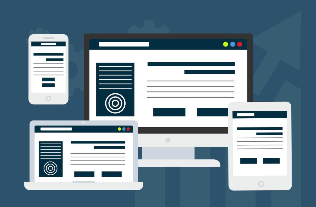
The image above gives a visual overview of how responsive design works. From the full design on the desktop and laptop to the more scaled down versions, which have been optimised for the smaller screen sizes of the tablet and smartphone.
If your website is older, you need to make sure it scales and displays properly on all devices.
Most web designers use responsive design as standard now. Website builder platforms use it too, but the results aren’t always predictable and the elements on some websites can look like an epic car crash on smaller screens.
You can check how your website looks on different screens using a responsive testing app, like Screenfly.
3. Appealing appearance
Humans make visual decisions at lightning speed. For example, did you know, it takes less than two tenths of a second for visitors to form a visual first impression of your website?

If it pleases their eyes, they’re more likely to stay and enjoy the experience. If it has the visual appeal of a fungal infection, maybe not so much.
To give the best user experience, your website has to look good.
That means:
- Professional and tasteful
- A clean, well-balanced design
- Consistent use of typefaces and colours
- High-quality photos and visuals (see point 9)
- Considered use of colour and colour combinations.
4. Crystal clear hero section
The hero section of your website is the first thing your visitors will see when your website loads. It has to make the right impression and give visitors a reason to scroll down and keep reading.
In clear, accessible terms, your hero section should explain:
Who you are
This will be in your logo/company name, which usually appears at the top of the screen.
What you do
Explain what you do in a nutshell, using accessible language and avoiding unnecessary jargon.
Who you do it for
Give a brief description of the ideal customer you work with or sell to.
Why they should care
Explain the main benefit you’re offering and why they should choose to buy from/work with you specifically.
Your hero section might also include:
An appropriate call to action
The call to action (CTA) is typically a button or link that will prompt your visitors to take action.
For example:
- ‘Get started’
- ‘Browse products’
- ‘Choose your plan’
- ‘Start your free trial’.
Simple site navigation
At the top of the screen, you’ll either have text links to your top tier pages, or a collapsible burger menu if you prefer a cleaner look.
Trust signals
For example:
- Logos to show your professional memberships/accreditations
- Your star rating on independent review sites, like Trustpilot
- Logos of high-profile customers who’ve trusted you
- An example of a customer testimonial.
Contact information
If you do a lot of business over the phone or via email, you might have your phone number or email icon in your hero section.
5. Make visitors feel seen
Visitors have the best user experience when they feel seen and understood. If they’ve been struggling for a while, it can be a huge relief to find a website that speaks to them and shows an understanding of their problem.

To make your visitors feel seen like this, you have to understand them and be able to articulate their problems and needs in a way they can relate to.
Some of this understanding will come from listening to your customers. But these are the people who’ve already found you. To reach the people who haven’t found you yet, you need to attract them to your website by tapping into what they’re searching for. For this, you’ll probably need an SEO content strategist.
6. Predictability and familiarity
These days, most websites follow similar patterns.
For example, they have familiar page layouts, including:
- Hero section at the top of the homepage
- Navigational section at the top right
- Company logo in the top left
- Visual hierarchy of headings
- CTAs clearly marked on buttons.
And they work in a predictable way, so visitors have a good idea of what will happen when they take a particular course of action.
For example, clicking on the company logo is like clicking the heels of your ruby slippers together, because it takes you back to the homepage. Clicking on the ‘contact us’ button will open an email or bring up a contact form.
I’ve talked with prospects who wanted to break the mould on this and do something completely different and ‘out there’. But they never had a good reason beyond not wanting to be predictable.
Bottom line is, your visitors don’t want a website that needs a handbook to tell them how to use it. They like predictable, familiar and intuitive because it makes them feel safe, comfortable and confident.
7. Intuitive navigation
Most websites also follow the same navigational framework. I’m simplifying it here, but it’s usually something along the lines of Home, About, Services or Products, Blog, Contact.

Again, websites follow this same framework because it’s familiar, intuitive and easy. There’s no learning curve and nothing that needs to be figured out. This means visitors can go straight in and find what they’re looking for easily. And, to them, that’s priceless.
8. Logical structure
To be intuitive and easy to use, a website should be logical. It should feel considered and natural.
Information should be organised and presented in a logical way, with relevant content grouped together, on the pages where visitors would expect to find it. Products should be well-organised and categorised according to how visitors might search for them.
9. Effective visuals
The visuals on your website should give your visitors confidence and help build their trust.
They should help visitors get a true sense of who they’re dealing with and what they’re buying, or buying into.
To do this, they should be high quality, relevant — and, ideally, unique to you. They should represent your brand, business, people and products professionally and authentically.
Brands using stock images to represent them can give the impression they have something to hide. Brands using poor quality or low-res images can come across as amateurish or spammy.
10. Clean and uncluttered design
The best user experience comes from simple, clean design with plenty of white space that lets the content breathe.
It wasn’t always this way. In the 90s, websites tended to be crammed with content. Most websites used a three-column format that, in retrospect, was cluttered and confusing. With everything on the page vying for attention, it was overwhelming and visitors didn’t know where to look first.
A clean and uncluttered website is designed to focus your visitors’ attention on what matters. Typically, it will have a simple, one-column format, thoughtful placement of images and no unnecessary distractions.
11. Legible text
To give the best user experience, the text on your website should be legible and easy to read on a screen. There are a couple of things to consider here.
Choose legible fonts
The legibility of your text starts with the fonts you choose.
Avoid fonts that are bold, condensed or overly fancy. These fonts never scale well and can be difficult and tiring to read.
As a guide, look for:
- Simple fonts that are evenly and consistently weighted
- Fonts with distinct letters that don’t look confusingly similar
- Fonts with clear ascenders (b, d, h) and descenders (g, p, q)
- Letters that are well- spaced and sit on a consistent baseline.
Consider your font size
Use a font size that’s easy to read and vary it for smaller screens.
Your body text should be at least 16pt on the desktop version and at least 18pt on mobile.
Use good contrast
Use contrasting colours that make the text stand out from the background. This could be dark text on a light background — like black text on white. Or light text on a dark background — like white text on black.
Use plain backgrounds
Your text should be on a plain background, or a plain portion of the background so it stands out and is legible.
If your website has responsive design — and it should — make sure the text stays legible when the background resizes to fit smaller screens.
12. Easily scannable content
A lot of people have a tendency to scan content online — especially if they’re looking for specific information. To give them the best user experience, it’s best to make that easy for them.
Clients have asked me if making their content harder to scan would force their visitors to read more, but it doesn’t work like that. Unless you’re standing over them with a cattle prod, you can’t force your visitors to do anything. Though making your content harder to scan might force them to leave your website and go to one of your competitors.
My advice? If you want your visitors to stay on your site and read your information, make it interesting and worth reading. The people who want to read it will read it. The people who want to scan it will scan it and read the bits they want to read. It’s a win-win — or as near to a win-win as you’re ever going to get.
How to make your content easily scannable
Formatting your content in a way that’s easy and pleasant to read will benefit all your visitors — the readers and the scanners.
To do this, use:
- A clear visual hierarchy with headings and subheadings
- Relevant headings to introduce each new section
- Left-aligned text as much as possible
- Short, easily digestible paragraphs
- Short line lengths.
13. Clear and obvious calls to action
Your calls to action (CTAs) are where you prompt your visitors to take an action. For the best user experience, you need to place an appropriate CTA in the most appropriate place — where your visitors are most likely to want to take action.
CTAs are generally categorised in terms of how much commitment they require.
For example:
- Soft CTA — no commitment — e.g. reading an article, browsing products or watching a video
- Intermediate CTA — low commitment — e.g. free trial, free download, subscribing for emails
- Hard CTA — most commitment — e.g. buying a product, registering for a service, making a booking.
The clearest and most obvious CTAs make it easy for visitors to take their desired action because they’re hard to scroll past and ignore. I’m talking bright, contrasting buttons, like these:

The CTA buttons should also be clearly labelled, so visitors have a reasonable expectation of what will happen when they click — and aren’t afraid to click!
14. Consistency
To give the best user experience, your website should feel ‘together’. Everything should feel like it belong sand nothing should feel incompatible or out of place.

For example, your site should have consistent:
- Fonts, colours and branding
- Page layouts and styling
- Photography and imagery
- Messaging and tone of voice.
Consistency in all these areas will mean everything is working coherently together to build your visitors’ trust and confidence. And nothing is jarring or causing them to doubt you.
15. User-first content
If you want to give the best user experience, it makes sense that your content is putting your visitors — the people who are actually using your website — first.
That means content that:
- Is created for your human audience — not for Google
- Matches visitors’ search intent
- Satisfies your visitors’ wants and needs
- Answers your visitors’ questions
- Solves your visitors’ problems
- Makes it easy for visitors to find what they need
- Gives a smooth and friction-free user experience.
16. Exceptional functionality
This might be an obvious one but, to give the best user experience, your website has to work.
To make sure your website has exceptional functionality, here are a few things to do:
- Address issues with lag or long loading times
- Check your processes are working smoothly and converting
- Use 301 redirects to avoid broken links and 404 errors
- Install a broken link checker and fix broken links quickly.
17. Anticipate what visitors want next
The best website website experience is considered and intuitive. This means giving your visitors the options to do what they want to do, when they’re ready to do it.

At each point where you’re giving your visitors options, think logically about where they’ll want to go next and what they’ll want to do next.
Be choosy and avoid giving too many options as this might confuse them or distract them from converting.
18. Security and privacy
Visitors will want to be sure your site is safe and takes their security and privacy seriously — especially where you’re asking them to give their sensitive information.
To reassure them, make sure your site includes:
- The latest security settings (https:// and a padlock icon)
- Data encryption, wherever necessary
- Strong authentication for making payments and accessing customer areas
- A privacy policy to explain what data is collected and how it will be used
- A cookie notice with clear options to decline cookies
- An opt-in rather than an opt-out for marketing emails
- Terms and conditions they can read and agree to
- Trust badges, like SSL secure checkout.
Use plain English, be honest about the measures you’re taking, stay true to your word and respect the choices your visitors make.
19. User-friendly forms
Visitors should be able to complete your forms successfully every time. This is important for you, too, because every form that’s abandoned counts as a conversion missed.
The highest converting forms are the clearest and simplest ones, so:
- Keep forms as short and easy-to-complete as possible
- Only collect the information you really need
- Be clear about what you’re asking for and use unambiguous language
- Break long forms into sections and use a progress bar or step count
- Confirm each section is correct as they complete it
- Use plain English error messages at the site of the error
- Confirm to your visitor their form has been submitted.
Test your forms regularly, especially after platform/plugin updates and other changes.
20. Accessibility
The best websites create the best user experience for everyone, including those with disabilities and other limitations. In many cases improving accessibility for those who need it improves the usability for all users.

Accessibility is commonly guided by the Web Content Accessibility Guidelines (WCAG). The guidelines are built around four core principles: Perceivable, Operable, Understandable, Robust (or POUR, if you’re partial to an acronym).
So what does this mean in practice?
Here are a few tips to make your website more accessible for all users.
Visual accessibility
This is particularly helpful for blind and visually impaired visitors, but can improve the user experience for all users.
For the best user experience, use:
- Legible fonts
- Effective colour contrast
- Appropriate font sizes — especially for body text
- Text labels on icons
- Alt text on meaningful images (skip the decorative ones).
You should also allow visitors to zoom in without crashing your layout.
Keyboard accessibility
Some visitors can’t use a computer mouse, so all your interactive elements should be keyboard operable and users should be able to tab through your content.
Motion and animation
Some visitors are affected by motion and flashing images. If you’re using video or animation on your site, keep it to a minimum, make it optional and include warnings and an opt-out if there’s a chance it could cause a seizure.
Audio and video accessibility
Some visitors could be hearing impaired. Others work in environments, where they’ll need to consume your audio and video content silently.
To give them the best user experience:
- Avoid autoplay content with the volume on
- Caption any spoken videos
- Provide transcriptions of any audio content
- Let visitors choose to have sound and control the volume.
Cognitive accessibility
Some visitors struggle to process information and can suffer from cognitive overload. For these visitors, a good user experience focuses on clarity and helps them avoid overwhelm.
To give them a better experience, be clear and:
- Keep your page layouts simple
- Use plain language, avoiding jargon wherever possible
- Break content into short, easily digestible sections.
- Use relevant headings to introduce each section
- Vary your layout with bullets, pull quotes etc
- Give simple, limited choices
- Guide them step-by-step through tasks and processes.
21. Accessible contact information
A lack of contact information is one of the most off-putting things you can see on a website. Seriously.
If your contact information is missing, or buried and difficult to find, it could make your visitors think twice about engaging with your site and brand.
Why?
Because displaying your full contact information makes you look like a credible and trustworthy business.
Because if something goes wrong, visitors will want to know they can contact you to get it resolved.
Because knowing you’re there for them, if they need you, is key to the best customer experience.
Want to make your website visitors happy?
I’m Jenny Lucas, a freelance copywriter specialising in websites, blog content, and SEO.
I’ve been writing websites since 2010 and have even built a few from scratch. This means I take a more holistic approach to website copywriting. In addition to the words, I think about things like user experience, navigation, page layouts and processes.
So if you’re looking for a website copywriter who can offer you something more, I could be the one!
To find out more about me and my work:
Learn more about my SEO copywriting service >>
Check out my copywriting portfolio >>

You might also like…