
UPDATED JULY 1, 2025
Writing for the web is a skill
Writing for the web is a completely different skill than writing for print and it needs a different kind of know-how.
This is because people read differently on a screen to the way they would read a book or newspaper.
On a screen, it’s much more natural to skim-read — especially if you’re looking for specific information.
Formatting your copy in the way I’m about to show you will allow for easy skimming. But it will also make it easier to read — meaning that more of your copy and content will be read.
And, let’s face it, that’s what everyone with a website wants.
How to format your writing for the web
Choose a clear and legible typeface
First thing’s first. When you’re writing for the web, you need to choose a typeface that’s clear and easy to read on a website.
Fancy scripts, cartoonish lettering and novelty typefaces might seem appealing or a good fit for the theme of your business. But if they’re difficult to read, your visitors won’t read them.
Examples of typefaces
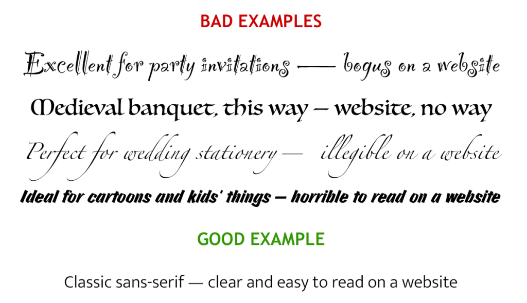
The easiest typeface to read on a screen is a clean, simple, sans-serif with letters that are easy to distinguish — even at a smaller size.
Which brings me onto my next point.
Get the sizing right
Your text needs to be large enough to read — particularly the body text, which is the smallest and most used.
Toptal.com recommends the following body text sizes:
- Smartphone screen: 12–16 point
- Tablet/laptop: 15–19 point
- Desktop computer: 16–20 point.
The actual size you need will also depend on your typeface and web design.
Chunky, condensed typefaces, like Impact work well as large headings, but don’t read well at body text size.
Websites with minimal copy can take larger size text. But if your site has a lot of explanatory copy, it’s best to keep to the smaller end of the scale.
Use good contrast
To achieve good contrast, you need to choose a text colour that stands out from the background colour.
This is important for accessibility and the comfort of your visitors. It makes your site more readable for visitors with and without visual impairments.
Examples of text/background contrast
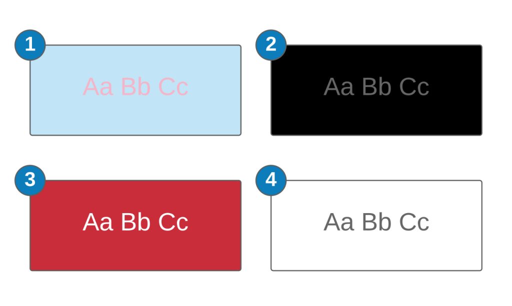
Bad examples
1. Baby pink text on a baby blue background
I once saw a baby clothing website that was written like this. The website owner probably thought it was cute, but it was horrible to read. And, after a while, the colours seemed to merge together in a muddy mess.
2. Grey text on a black background
Sure it looks sophisticated, but you get eye strain trying to read it.
Good examples
3. White text on a red background
The contrast here is much better, though the novelty of reading from a red background wears off pretty quickly. So if you do go down the light-text-on-a-rich-coloured background route, perhaps use it more sparingly.
4. Black text on a white background
The highest contrast pairing — and the easiest to read. You might find black and white too harsh, but, as a rule, dark text on a light background is definitely the best combination.
Use a simple layout
When you’re writing for the web, you have to allow for readers using different devices/screen sizes and scrolling within the window.
This is why using multiple columns and randomly placed text boxes can be a bad idea.
A simple, single-column format works best for the plain text portions of your copy because it’s easiest to read, least distracting, and visitors don’t have to keep wondering which section to read next.
Align your text for easy reading
Left-aligned text is easier to read than centre or right-aligned text.
🟢
Left-aligned
With left-aligned text, each line starts at the left margin, which feels natural, because we read from left to right.
Use it as much as you like.
🟠
Centre-aligned
With centre-aligned text, the starting point of each line changes, and readers have to work harder to follow it.
Use it sparingly and for shorter paragraphs.
🔴
Right-aligned
Right-aligned text anchors itself to the right-hand margin and each line starts from a staggered position on the left, which feels unnatural.
Avoid it or use it sparingly.
Keep your lines short
Avoid having long lines of text that span the entire screen. While these lines will wrap on smaller devices, they make for unpleasant reading on a larger screen.
The optimum number of words per line, for easy reading, is between 7–12.
Break it down
The way you format your copy has a huge impact on how easy it is to read — and how much will actually be read.
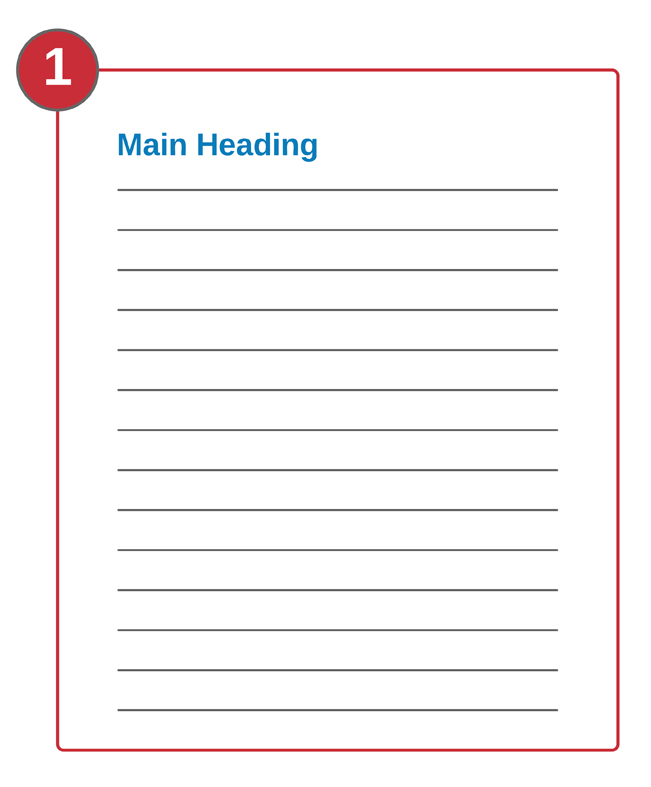
1. Huge walls of text with no breaks — don’t do this!
There’s nothing more off-putting to a website visitor than seeing long, dense walls of text — especially when it’s justified, like this. This kind of format is difficult to read on a screen and makes it difficult to scan for specific information.
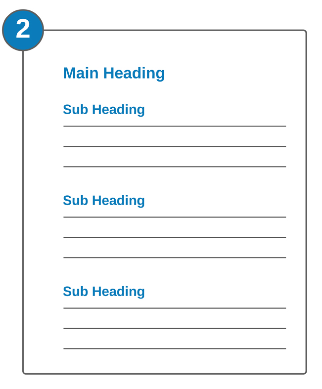
2. Use short paragraphs and relevant headings
Keep your paragraphs short and add a full line space between them so they’re surrounded by white space. Using headings/subheadings to introduce each new section will help readers scan for specific information.
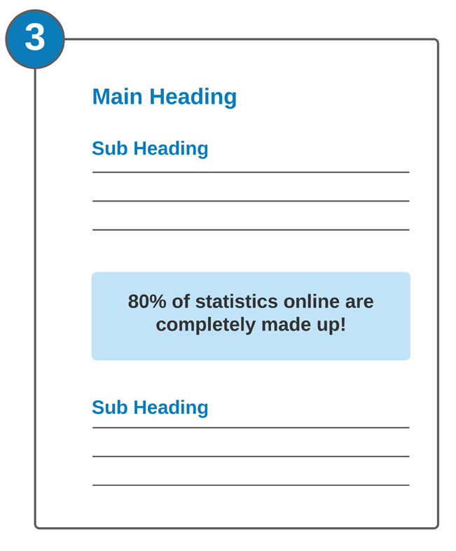
3. Use call-outs to highlight key information
A call out is a panel that’s set apart from the rest of the text to highlight a particular piece of information.
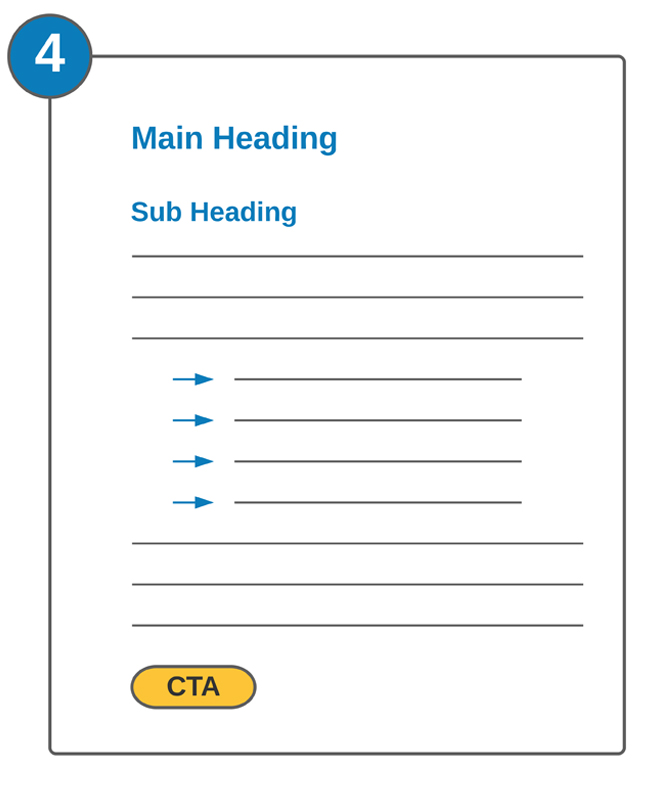
4. Vary your format
You can add interest to your layout by varying the way you present your content. This can include paragraphs, lists, charts, pictures and diagrams.
Use relevant headings
When you’re writing for the web, you should use a different heading/subheading to introduce each section/subsection. Make sure each one is relevant to the content that follows it, as this will help readers skim to the parts that particularly interest them.
Relevant headings are also good for optimising your content so it gets picked up by the search engines.
Do you need help with writing for the web?
I’m Jenny Lucas, a website copywriter and blog content writer based in Leicester, UK.
I’ve been writing for the web since 2007 and specialise in SEO copy and content that will help get your website found on Google.
If you need someone to write your website, or provide regular content for your blog, why not get in touch?

You might also like…