
Is your website full of holes?
Is your website like this leaky bucket?
Are potential customers, leaking — I mean leaving, but, metaphor — without buying?
If you want to stop that happening, you need to plug the holes.
Your website should be watertight
Your website shouldn’t be giving people reasons to leave. It should be engaging them, anticipating what they need at each point of their journey — and delivering it.
To fix it, you need to find those points of weakness and reinforce them. Strengthening your website and making it watertight, with no holes for your valuable visitors to leak out.
But how do you know where the holes are? And, more importantly, how do you fix them?
Why visitors leave websites prematurely
To fix any problems, you need to understand where/why your visitors might be leaving your website. And that’s what we’re going to look at now.
Visitors won’t wait for a slow website to load
People are impatient online. If your website doesn’t load fast enough, a proportion of your would-be visitors will abandon their visit before they even arrive. And that number increases with every extra second it takes.
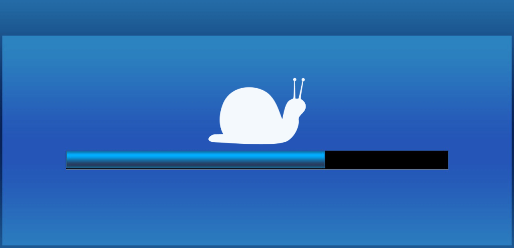
How fast should your website load?
A website that loads instantly, in a millisecond, would be ideal. But, for 2025, the general consensus is anything under 2 seconds.
You can check your website’s load speed using this handy GTmetrix tool, which will also give you actionable tips on how to improve your site’s speed.
What are the common causes of slow loading?
Large images and media files
You need to make sure all the files in your media library have been optimised for the web. Optimising them means compressing them to the smallest file size possible without a noticeable reduction in quality.
Low-performance web hosting
Cheap hosting can be a false economy if it’s at the expense of website performance. If you want something better, here’s an excellent guide from Liquid Web: How to choose the right hosting provider in 2025 >>
Too many features or effects
Removing or rethinking some of your bandwidth-heavy elements will give you a simpler, more streamlined website, cutting load times and lag.
Custom fonts
Custom font files are just another element a browser has to load. If you have more than one, you could consider substituting one for a more mainstream font with a similar appearance.
Messy coding
Messy coding is harder for a browser to decipher. To avoid it, always work with a reputable web designer, get major edits made professionally and avoid using too many plugins or libraries on your site.
Visitors are put off by bad design
When visitors land on a website, it takes them 50 milliseconds to form an opinion of it. This was the finding of a research paper published in 2011 and it still applies today.
A website’s design is one of the first things visitors will notice. And if it’s bad, chances are, they won’t stay.

What constitutes bad website design?
A website that’s dated, hard to read, or just plain ugly is never going to entice visitors to stay. Here are some of the reasons why.
The website isn’t responsive
Modern web pages use responsive design, which means they automatically resize and reformat for different screen sizes. If your site isn’t responsive, it will give people browsing on tablets or smartphones a terrible experience.
The website looks amateurish
If your website looks like it’s been cobbled together in a DIY website builder, by an amateur with no skills, visitors might think your business is amateurish, too. That could be a big red flag — and their cue to leave.
Too much clutter and too many distractions
Overwhelming your visitors with clutter and diverting their attention with distractions is never a good idea. If they don’t know where to look or how to proceed, they might just give up and leave.
Issues with the web copy
I’m talking about things like:
- Illegible fonts
- Tiny text sizing
- Poor text/background contrast
- Huge walls of text with no breaks.
Issues like these can make reading copy on a website extremely difficult or even impossible.
Issues with the website’s images
Maybe you have AI or stock images on your site that don’t seem genuine. Maybe your images are poor quality and/or still have watermarks on them. Maybe you’ve edited the images yourself and done a bad job. These could all be red flags and off-putting for your visitors.
Visitors get confused when they don’t know what to do
A visitor who feels confused, overwhelmed, or apprehensive is never going to become a customer.

How does a website confuse its visitors?
Web copy that’s difficult to understand
Within the first few seconds of landing on your website, visitors should understand:
- Who you are
- What you do
- What you’re offering them
- Why they should care about it.
If they don’t understand these basics, you’ve fallen at the first hurdle and you’ll struggle to keep them on your site.
Poor navigation
Your website navigation should make it easy for visitors to find their way around and locate the information they need. But sometimes:
- Link titles don’t match the page content and page content doesn’t meet visitor expectations
- Menus are too extensive
- Links are broken and go to the wrong page or the Error 404 page
- Menu items are too close together, giving a bad experience on smartphones.
Poor navigation can leave visitors confused, overwhelmed and frustrated to the point where they have no other option but to click away.
Inconsistencies
Inconsistencies make visitors feel confused and apprehensive. For example, if:
- The images on your site don’t match the perception visitors have of your business
- Your web copy sounds like it’s been written by lots of different people
- The terminology you’re using keeps changing throughout the site
- Your instructions or processes don’t match up.
Issues with the CTAs
CTAs are your Calls to Action. They tell your visitors what action to take. For example: Buy Now, Shop Now, Subscribe. But they can be confusing to visitors if:
- There are too many CTAs or not enough
- CTAs are badly timed or in the wrong place
- CTAs are unclear or not obvious enough
- The CTA isn’t appealing or enticing enough
- The CTA wording is ambiguous or vague, so visitors don’t know what to expect if they click.
Your CTAs need to anticipate what actions your visitors will want to take and when.
Visitors find your website annoying
Some website features are so irritating, they could be costing you visitors — and, ultimately, customers.

What irritates your website visitors?
A bad user experience is anything that makes using your website unnecessarily difficult, irritating, confusing or overwhelming. Let’s look at some examples.
Autoplay videos
Your visitors land on a website and are immediately confronted with a video. This can be a nightmare for them, especially if their internet is slow, and it:
- Takes too long to load
- Looks pixelated and has to keep stopping and buffering
- Stops them from viewing other elements of your homepage
- Starts up with sound, which may not be welcomed in a busy workplace.
If any of these things happen, your visitor will probably just give up and close the tab.
Intrusive pop-ups
Pop-ups are divisive. The people who sell them say they work, but most website users I speak to hate them with a passion. And they could be causing visitors to leave your site if:
- There are too many
- They pop up too early
- They pop up too frequently
- They’re hard to close down
- They don’t seem appropriate.
Functional issues
If your website isn’t working properly, your visitors won’t stay. Common functional issues include:
- Lagging and buffering
- Broken processes
- Buttons that won’t click
- Forms that won’t submit
- Sticky elements blocking the content
- Search function that doesn’t work.
Dark patterns
Dark patterns, aka dark UX, is devious, manipulative and deceptive. When it’s used on a website, the design and copy collude to mislead, confuse and trick visitors.
Visitors are bored
Your website should make visitors feel engaged, inspired and motivated. But if won’t if it bores them instead.

What makes a website boring?
A boring website that fails to engage your readers will make them zone out and switch off.
Lack of visual stimulation
Some websites are boring to look at, because they have:
- A rigid and invariable format
- Walls of text with no breaks or headings
- A monochrome or gloomy colour palette
- An ugly, rudimentary or unsophisticated design
- A lack of graphics, photographs or other visual media.
Lack of personality
Every website will have a visual personality (how it looks) and a verbal personality (how it sounds). But a website that visitors find boring might:
- Look insipid and unremarkable
- Have a voice that’s droning and monotonous
- Sound robotic and lack humanness
- Be too corporate and bureaucratic.
Boring content
Boring content is like shredded wheat straight from the packet: dry, uninspiring and hard to digest. If it doesn’t hold your visitors’ attention, that’s probably because it’s:
- Difficult to read and understand
- Made up of long, monotonous sentences
- Not what your visitors really care about
- Factual, but tedious and makes no emotional or relatable connection
- Using unfamiliar jargon and language you need a dictionary to decipher.
Visitors don’t trust you
Visitors will leave a website without taking action if they don’t feel it’s trustworthy.
What might make a website seem untrustworthy?
There are a several things that would give a visitor reasons to be cautious.
The website looks dated or amateurish
If your website doesn’t look current or professional, that could cause visitors to think you’re not a serious business. And this could be a red flag for them.
Lack of contact details
If there are no easy ways to contact you, visitors will be understandably wary. Because if there’s a problem or they need urgent assistance, they need that reassurance that you’ll be on-hand to help them.
A business address shows you’re a real business. A phone number shows visitors it will be easy to contact you, if they need to. A professional email address, independent of your website forms, is always reassuring to see.
Lack of social proof
Social proof — in the form of reviews, testimonials and case studies — shows visitors the experiences other customers have had when working or dealing with you.
If you don’t have any, it would suggest you’re too new as a company, that you don’t care what your customers think, or that no one has had good things to say about you.
Elements that don’t ring true
These are things that make your company look inauthentic. Like stock photos of slick, American offices, when you’re actually based in Basildon. Or obviously Photoshopped images of your premises or staff.
A website that seems abandoned
Broken links, errors, and dated blog articles can make a website feel abandoned, forgotten and not to be trusted.
Want to stop your website leaking visitors?
If your website is leaking visitors like a holey bucket and you know you need to fix it, maybe I can help.
I’m a freelance SEO copywriter and website specialist based in Leicester, UK.
I’ve been working on websites since 2009 and I’ve seen them all: good, bad and very, very ugly.
Whether you need an objective second pair of eyes to help you see where the problems are, or a copywriter who can help you craft copy that’s clearer and more compelling — that could be me.
To find out more:
Read more of my articles about websites >>
View my copywriting portfolio >>

You might also like…